 Nederland
 België
 France
 Deutschland
 Österreich
 International
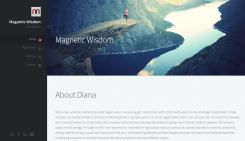
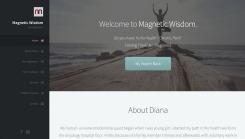
The left side (dark) will not move. The part on the right is where the content will show up. If you scroll down, this is the part that will scroll. It's the same as the layout I uploaded before this one - I did this so you can see the top in detail.
Website for Energetic Medicine Company
- Contest holder: di_ezgo
- Category: Website design
- Status: Ended
Start date: 24-02-2017
Ending date: 03-03-2017
Total budget: € 499.00
Latest design
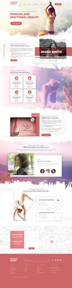
It all started with an idea...
A short, interactive guide helped them discover their design style and clearly captured what they needed.
Brandsupply is a platform where creative professionals and businesses collaborate on unique projects and designs.
Clients looking for a new logo or brand identity describe what they need. Designers can then participate in the project via Brandsupply by submitting one or more designs. In the end, the client chooses the design they like best.
Costs vary depending on the type of project — from €169 for a business or project name to €539 for a complete website. The client decides how much they want to pay for the entire project.
Designer:
 84wendy
This contest is finished. Its not possible to reply anymore.
It's a bit hard to show you in 1 image like this how to website looks. The left side of the layout (the dark grey area with the links etc) doesn't move - when you scroll down the page only the content will scroll. On the image here there are white breaks between pages - this is only to show that the left side of the page will stay put, it will not move so the links are always visible. The right side will scroll down (without gaps of course). I hope that made sense. It looks really good promise! I'll also upload an image of just the top so what will show up on the screen.
You can view the website here (so you can see how it works as the image doesn't do it justice: http://nanniesontour.com/p2/
This contest is finished. Its not possible to reply anymore.
Clean cut layout with beautiful imagery. Text very clear to read.
This contest is finished. Its not possible to reply anymore.
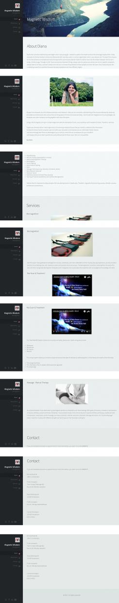
I kept the layout clean and clear as a cluttered layout isn't that pleasant on the eyes of the viewers. Everything is on 1 page so you can scroll down through everything. You can also click on a link in the menu on the left which will make you jump to that part (so you won't have to scroll through everything if you don't want to). Everything on 1 page means that it's easier for you to edit / add or delete text etc.
The links on the left can of course be changed, as well as for the text. I started with the About You bit but can change that to however you would want to start the page.
The image on the site on top can also be changed if you prefer another one.
This contest is finished. Its not possible to reply anymore.
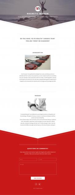
Page of the website. The top and bottom will be the same on every page. In the middle as much text can be added. I only added two of your services on this example. You will of course receive all files of all the pages with all the text added that you currently have on your old website. If you ever need help with adding things to a page, I am happy to help.
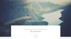
I have another idea for a layout so I'll go work on that now.
This contest is finished. Its not possible to reply anymore.