No comments
Design a Modern, Happy Logo for a Gadget/Gift-shop
- Contest holder: xbenx
- Category: Logo design
- Status: Ended
- Files: File 1, File 2
Start date: 24-09-2014
Ending date: 20-10-2014
It all started with an idea...
A short, interactive guide helped them discover their design style and clearly captured what they needed.
Brandsupply is a platform where creative professionals and businesses collaborate on unique projects and designs.
Clients looking for a new logo or brand identity describe what they need. Designers can then participate in the project via Brandsupply by submitting one or more designs. In the end, the client chooses the design they like best.
Costs vary depending on the type of project — from €169 for a business or project name to €539 for a complete website. The client decides how much they want to pay for the entire project.
No comments
No comments
No comments

No comments
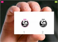
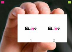
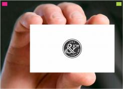
Thankx for degrading the stars ... i worked accordingly to your brief in circle and with to the point &joy; with Life's a Gift ....all th ebest
No comments
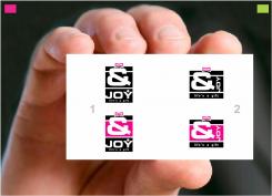
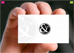
I wish you can feel and see in my creative i have shown very clean clear with little twist in the logo, which is eye catching and easily readable and can be transfer to any media without disturbing any elements in the logo ....

No comments
No comments
No comments

No comments
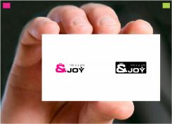
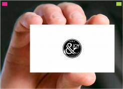
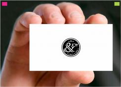
Wish you can feel the joyness of the logo... i have shown the smiling face of kid instead of "O' and in "Y" i have shown the figure of kid or young with joyness and you can feel it raising hands with joy .... looking for your consideration and feedback pls....
Overall concpet in first glance you will recognise it with joyness and can be easily readable even in small size too as stickers
No comments
I like the first one better (round), maybe without the smiley-face
 Nederland
 België
 France
 Deutschland
 Österreich
 International
