Alle aanpassingen zijn mogelijk!
CREATIVE LOGO + STATIONERY FOR NEW SOCIAL MEDIA COMPANY!
- Contest holder: Contineo
- Category: Logo & stationery
- Status: Ended
Start date: 10-08-2013
Ending date: 26-08-2013
It all started with an idea...
A short, interactive guide helped them discover their design style and clearly captured what they needed.
Brandsupply is a platform where creative professionals and businesses collaborate on unique projects and designs.
Clients looking for a new logo or brand identity describe what they need. Designers can then participate in the project via Brandsupply by submitting one or more designs. In the end, the client chooses the design they like best.
Costs vary depending on the type of project — from €169 for a business or project name to €539 for a complete website. The client decides how much they want to pay for the entire project.

NL:Het design ziet er vreemd uit, vooral omdat we niet zien wat de zwarte cirkel moet voorstellen. Daarbij houden we ook niet zo van de zwarte letters.
ENG: The design looks rather strange, we don't understand what the black circle should represent? Furthermore we don't like our name in black.

No comments
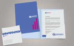
NL: Het design is nogal simpel. We hebben geen specifieke feedback, maar probeer bij het volgende design iets speelse erin te verwerken.
ENG: The design is quite simple. We don't have specific feedback, but try to incorporate something more playfull in your next design.
 Nederland
 België
 France
 Deutschland
 Österreich
 International
