Logo and Design for Catering Company
Contest details:
Gold
- Contest holder: mvirmond
- Category: Logo & stationery
- Total budget: € 449.00
- Start date : 02-10-2012 18:08
- Ending date : 12-10-2012 17:55
- Status : Ended
- Required formats: jpg,psd,für Visitenkarten, Broschüren und Guidelines sind möglich: Word, Pages, PDF, Powerpoint oder Keynote
- Relevant files: None
- Available languages:
- Number of designs: 221
-
Response rate:
low high
Needs:
Specifically, final submissions should include:
- Logo
- Color scheme (e.g. for our website)
- Brief guidelines für using logo, colors and fonts
- Template for business cards
- Template for brochures
You may initially submit just the logo. We will provide feedback on a regular basis. If we like the logo (4-5 stars) you can submit the remaining elements later (however, please submit them BEFORE the competition finishes).
Company description:
We are offering catering for companies/offices in central Switzerland (esp. Kanton Zug).
In particular, we offer lunch options (initially salads, sandwiches, juices, desserts), at a later stage potentially expanding into other product groups and services/delivery times. All orders are placed online.
We aim to position ourselves with high quality, fresh, tasty, healthy/light products, at a very affordable price.
Additional brand attributes include: regional (central Switzerland), innovative, reliable, clean/hygienic.
Our brand name includes "essen" (German for food), "essence" as well as "sense"/"senses".
Target group:
Our target customers are business people/office workers in central Switzerland, i.e. above average income, appreciative of quality, international mix.
We aim to target in particular those customers who are looking for high quality, healthy food.
Colors, favourites and other requirements
There are no restrictions for the logo design, we are open to all suggestions.
If the logo does not contain the brand name "essense" (capital letter spelling still tbd) in writing, your suggestion should also include a graphic design for the actual brand name.
The color scheme should include a suggestion which colors (RGB codes or similar) to use for background, highlighting, buttons, writing etc.
Guidelines should outline in a few bullet points how to use logo and color scheme (e.g. which background colors can the logo be placed on), as well as a suggestion for one (or more) font types (ideally standard fonts), and potentially other suggestions (at your discretion).
The brochure template will be used primarily for a summary of our offering and the company, presumably in a simple A4-portait-format - so this is not a flyer or anything fancy. Just simple application of the above logo and design (same for business card)
smeekes
-
-
Description by designer smeekes:
Very nice to see someone who gives a fully briefing to make it easier for the designer to deliver a good design.
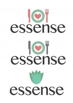
I have 3 variations and I would love to know which one you like or what you would like to see different.
The heart represents the love for food and that is what you guys will deliver: food made from the heart. The light colors represents the freshness of the food.
The flower is a more natural representation of the company.
Nature = Natural = Healthy
I will keep this assignment in my mind and I will keep brainstorming.
Let me know! -
mvirmond says :
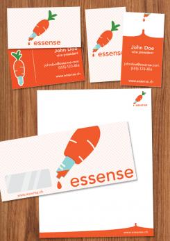
interesting design - a bit different. but doesn't quite convey the freshness i am looking for. i don't think it will make it into the final selection
-
This contest is finished. Its not possible to reply anymore.
-