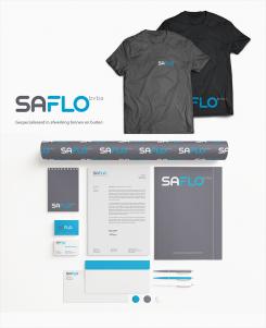
No comments
Branding for Saflo bvba
- Contest holder: marijn07
- Category: Stationery design
- Status: Ended
- Files: File 1, File 2
Start date: 16-02-2015
Ending date: 23-02-2015
It all started with an idea...
A short, interactive guide helped them discover their design style and clearly captured what they needed.
Brandsupply is a platform where creative professionals and businesses collaborate on unique projects and designs.
Clients looking for a new logo or brand identity describe what they need. Designers can then participate in the project via Brandsupply by submitting one or more designs. In the end, the client chooses the design they like best.
Costs vary depending on the type of project — from €169 for a business or project name to €539 for a complete website. The client decides how much they want to pay for the entire project.
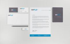
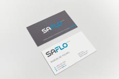
No comments
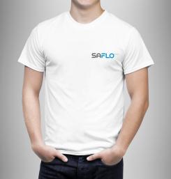
No comments
nice.
No comments
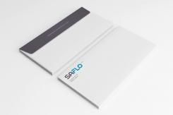
Nice design, but i think the adres needs to be at the back
No comments
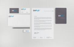
Please have a look at my proposal and let me know what you think. Thank you.
Kind regards
nice design! thanks
I just want to see how it looks with a thick blue horizontal line at the bottom of the paper in place of the vertical thin lines. can you make an example of that? thanks. grtzn Marijn
Got it. New entries were uploaded. Please check them out.
No comments
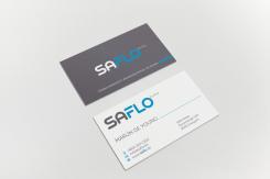
i like the back but not the blue line in the front.
Than you for the feedback. Did you mean thick line on the grey background, or thin line on white? Which one should I remove?
Hi, the thin line on white. grtz
 Nederland
 België
 France
 Deutschland
 Österreich
 International
