Dear cliënt,
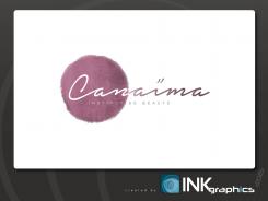
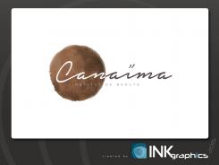
Here my renewed proposal for your logo.
Changes to the designs are not a problem, even after the contest!
Looking forward to hear from you!
Sincerely,
InkGraphics
Logo for a modern beauty institute - CanaÏma - institute de beauté
- Contest holder: Jon1224
- Category: Logo design
- Status: Ended
Start date: 20-09-2015
Ending date: 18-10-2015
It all started with an idea...
A short, interactive guide helped them discover their design style and clearly captured what they needed.
Brandsupply is a platform where creative professionals and businesses collaborate on unique projects and designs.
Clients looking for a new logo or brand identity describe what they need. Designers can then participate in the project via Brandsupply by submitting one or more designs. In the end, the client chooses the design they like best.
Costs vary depending on the type of project — from €169 for a business or project name to €539 for a complete website. The client decides how much they want to pay for the entire project.
Awesome!! Thanks a lot! What do you think it could enhance the logo?
No comments
Très beau travail ! Beau, simple, épuré, de très loin mon préféré même s'il manque d'originalité (on a l'impression de déjà vu), j'espère bien, au vu des différents logos réalisés que le vainqueur sera celui-ci !
Un de mes préférés! Top 3
Merci pour le compliment!
Maybe this!!!
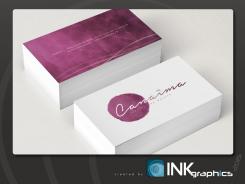
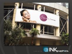
Can I see the logo in other real situation!! On a reception bank, visit card...
Can I see the logo in other real situation!! On a reception bank, visit card...
Hi,
Is it possible to see this logo in a visit card or a reception bank?
Thanks
Dear cliënt,
Here my renewed proposal for your logo.
Changes to the designs are not a problem, even after the contest!
Looking forward to hear from you!
Sincerely,
InkGraphics
Good idea to have faded the police!! Please keep sending me ideas like this because it'one of my favorite and i'm really curious to see what kind of enhancement you could bring
You know what could be great? The special effect you put for the "ï" in your previous logos
You know what could be great? The special effect you put for the "ï" in your previous logos
You know what could be great? The special effect you put for the "ï" in your previous logos
Dear cliënt,
Thank you for the feedback!
Here my renewed proposal for your logo.
Changes to the designs are not a problem, even after the contest!
Looking forward to hear from you!
Sincerely,
InkGraphics
Really beautyfull. I don t lnow what you could do for improving it. But the colour is amazing
Dear cliënt,
Thank you for the feedback!
Here my renewed proposal for your logo.
Changes to the designs are not a problem, even after the contest!
Looking forward to hear from you!
Sincerely,
InkGraphics
I really like this one!! The best you have done for me!! I like the the rouded faded color! Maybe just a touch of "beauty" is missing but it's one of my favorite design!
Dear cliënt,
Thank you for the feedback!
Here my renewed proposal for your logo.
Changes to the designs are not a problem, even after the contest!
Looking forward to hear from you!
Sincerely,
InkGraphics
Dear cliënt,
Here my proposal for your logo.
Changes to the designs are not a problem, even after the contest!
Looking forward to your feedback!
Sincerely,
InkGraphics
I see you have a lot of talent, i like the "ï" but I have already seen a lot of butterfly! Could you please make somthing that i've never seen! Something that would make me say WOOW! By the way the institute is name Canaïma!
Thanks a lot for the time and energy you spent for the project!
 Nederland
 België
 France
 Deutschland
 Österreich
 International

