More high tech font style with uppercase.
A new logo for an high-tech company
- Contest holder: a-lechat@corial.com
- Category: Logo design
- Status: Ended
- Files: File 1
Start date: 09-03-2017
Ending date: 31-03-2017
It all started with an idea...
A short, interactive guide helped them discover their design style and clearly captured what they needed.
Brandsupply is a platform where creative professionals and businesses collaborate on unique projects and designs.
Clients looking for a new logo or brand identity describe what they need. Designers can then participate in the project via Brandsupply by submitting one or more designs. In the end, the client chooses the design they like best.
Costs vary depending on the type of project — from €169 for a business or project name to €539 for a complete website. The client decides how much they want to pay for the entire project.
Second version is one simple flat and lettered logo. The logo shape is included as letter "o".
Also with changes you needed.
Thank you again.
Kind regards,
m3kdesign.wix.com/portfolio
Hi Mk3Design,
I’m glad to inform you that you have been selected as being one of the two finalist. Before the closing of the conquest, I would appreciate if you could finalize your logo.
There are talks around the font used for CORIAL and the fact that CORIAL is in lowercase. Could you think about it and maybe make two suggestions one in lower case and one in uppercase.
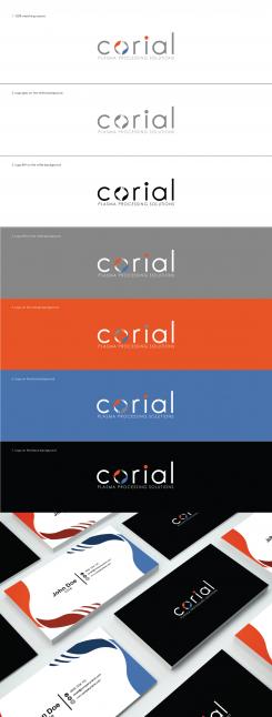
Each logo should be presented as follows :
- Little script explaining your logo, symbols, choices linked to our technologies and products …
- Colors matching 100% our request
- Coloured logo on a white background
- Logo GRAY RGB 134/134/133 on a white background
- Logo B/W on a white background
- Logo on a background GRAY RGB 134/134/133
- Logo on a background ORANGE RGB 231/83/38
- Logo on a background BLEU RGB 73/114/171
- Logo on a background BLACK
- Design of business card
You must also confirm that :
- The font used for the logo is not free of use
- The name the font used (or transformed) and supply us the font file
- All files will be give in ai and jpg
Next week the final logo will be shown to our employees who will vote for one of the two choices.
The order will be confirmed to the winner.
If you want to contact me directly, my mail is : a-lechat@corial.com
Best Regards,
André LECHAT
Dear a-lechat,
first at all thank you so much for choose my design.
Here is the first version with changes you needed.
Landscape logo with abstract wafer shape separate. (this logo could include and one centred version / the shape will be above the company name).
Hope that you like it.
Dear Corial team,
here is my first vision about your company.
Two abstract wings represent the synchronized process and high tech activities (all in one).
This logo is clean, flat, modern and there are a 3 different versions of positioning composition plus two versions (with "Asia" and "Europe" shapes).
Hope that you like it.
If you have some suggestions please feel free to contact me.
Kind regards,
m3kdesign.wix.com/portfolio
Hi M3kdesign,
Congratulations, you have been selected for the second round of our logo conquest and we would appreciate if you could work on the current logo according to the following specs :
1/ The abstract (orange and blue) should be a bit more round to represent a wafer.
2/ The three colors should be the following :
GRIS RGB 134/134/133 for the text “CORIAL” on the logo
ORANGE #e75326 RGB 231/83/38
BLEU #4972av RGB 73/114/171
3/ Texte : « PLASMA PROCESSING SOLUTIONS » en UPPERCASE
4/ The font is clean, flat and elegant.
5/ Make 3 version : 1x WITHOUT COUNTRY / 1x with « EUROPE » / 1x with « ASIA »
6/ Please ONLY submit the logo with a white background for an easy comparison with other candidates. Do not integrate into our website or business cards.
We will select next week 2 finalists to go further and finalize the logo design. At that time we will speak about version of logo (B/W on white background, logo on others background, business cards …).
Many thanks for your creativity.
André
 Nederland
 België
 France
 Deutschland
 Österreich
 International
