No comments
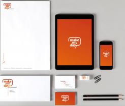
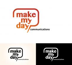
Design a youthful and inspiring logo + stationary for a new company in the communication and travel branch
- Contest holder: linanijman
- Category: Logo design
- Status: Ended
Start date: 25-02-2015
Ending date: 08-03-2015
It all started with an idea...
A short, interactive guide helped them discover their design style and clearly captured what they needed.
Brandsupply is a platform where creative professionals and businesses collaborate on unique projects and designs.
Clients looking for a new logo or brand identity describe what they need. Designers can then participate in the project via Brandsupply by submitting one or more designs. In the end, the client chooses the design they like best.
Costs vary depending on the type of project — from €169 for a business or project name to €539 for a complete website. The client decides how much they want to pay for the entire project.
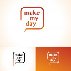
I think the logo is the icon. I took a small piece of the logo as eye-catcher. you can use this as a sort arrow guide) to discover the world
Thanks for the comment
Two modified versions
Again really liking this style and concept. Not sure if the 'Y' should be cut off like that, does make it more inspiring/happy. Maybe the logo needs more vibrance however I do like the fact that it is recognisable. Can you explain a bit what your thoughts on the wording bulb are and maybe some options on how to work with icons.
the wording bulb means communication, and is also a cocoon for the text inside "make my day" , the text refers to the people that you need to bring together. The site thats open in the balloon refers to a freedom to explore. What do you mean by saying 'how to work with icons' ? do you need icons? I hope you've been helped.
Thanks for your response. What I mean with Icons is that when used on various items or web based designs I would like to be able to use a single expressive icon that is recognisable for the brand. You have showed it on your other example, maybe you can work that out a bit?
 Nederland
 België
 France
 Deutschland
 Österreich
 International
