No comments
Design Logo for: Phone Buddy
- Contest holder: Phonebuddy
- Category: Logo design
- Status: Ended
Start date: 07-01-2019
Ending date: 13-01-2019
It all started with an idea...
A short, interactive guide helped them discover their design style and clearly captured what they needed.
Brandsupply is a platform where creative professionals and businesses collaborate on unique projects and designs.
Clients looking for a new logo or brand identity describe what they need. Designers can then participate in the project via Brandsupply by submitting one or more designs. In the end, the client chooses the design they like best.
Costs vary depending on the type of project — from €169 for a business or project name to €539 for a complete website. The client decides how much they want to pay for the entire project.
Thanks for all the good work! Will review this tonight!
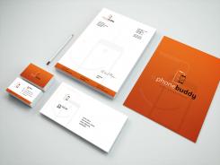
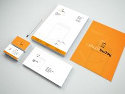
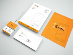
As requested I applied a darker orange while keeping the gradient. If you have other suggestions do not hesitate
Hi! Thanks for all the improvements. can you implement the second logo from the top with your latest submission? That is the one with the letters and business cards.
Hi Naelix,
I have asked some advice from some friend and they pointed out that the second logo from the top is definetely the favourite at this moment.
One person said that the phones were not alligned in the middle. After some close looks, it seems to be alligned correctly. However, it seems that it is not in the middle because you focus on the bigger phone. Do you understand what i am trying to say?
Hi Phonebuddy,
I understand but as you said it's correctly aligned (i checked it). Maybe should i center the big phone or make the smaller bigger ? Or reduce the logo ? I will try and show you the result
Hi Naelix, thanks for your reply. Please try a couple of options. Thanks!
Here again a new font, with a different layout. 3 proposals with slogan or not
Everything is available in several colors do not hesitate if you have preferences to submit.
I can also make the font lighter or bigger (extraalight - light - regular - medium - semi bold - bold - black)
Also, like this one, could you show me how the blue looks in orange?
Hi, here are new proposals
Different font here, a brighter blue color and a change in size for the left phone
No comments
Really like the logo in orange and how it looks on the letter. No need to change the logo, maybe change up the format.
I have to be more precise, I mean the 3rd from the top. Maybe a darker shade of orange would make it more clear. Could you also show me how the logo looks without the name? Because this will be used on products.
I'm doing this quickly
 Nederland
 België
 France
 Deutschland
 Österreich
 International

