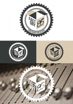
hello, here are two versions of the logo with the aqua color. To answer your question, if you choose this project, I send you three versions : the color logo, the logo in black and the white logo.
Factory 86 - many aspects, one logo
- Contest holder: sandervanderpoel
- Category: Logo design
- Status: Ended
Start date: 11-01-2016
Ending date: 25-01-2016
It all started with an idea...
A short, interactive guide helped them discover their design style and clearly captured what they needed.
Brandsupply is a platform where creative professionals and businesses collaborate on unique projects and designs.
Clients looking for a new logo or brand identity describe what they need. Designers can then participate in the project via Brandsupply by submitting one or more designs. In the end, the client chooses the design they like best.
Costs vary depending on the type of project — from €169 for a business or project name to €539 for a complete website. The client decides how much they want to pay for the entire project.
Hi Cedric! So sorry, I didnt get a notification of this so I was under the impression you hadn't replied. I'm choosing the colored one at the right bottom (so the sixth logo so to say, the lightest of the colored ones). If you're OK with it we have a deal! I will check this page more regularly now I know that I don't get the notification. Thanks! Sander
Hi, no problem.
I am, in any case, happy that you chose my proposal.
Concerning the files : we must wait for the Contest Closing (tonight at 21h) ; then you will be notified by Brandsupply to choose the winner. Therefore, I'll send the files to Brandsupply and they will send you the files. Regards,
Hello, I tried to make the pellicles more visible by adding details because , by enlarging one side as you suggest , we lose the symmetry of the logo. I can, however, try if you want.
No, this is great. So how does this work, do I need to choose one of these three color versions, or do I get all three of them?
Just regarding the color: can you try to take the logo at the right bottom (the beige/brown one) and then color the outer circle and '86' in a aqua based color like this: http://previews.123rf.com/images/ollinka/ollinka1501/ollinka150100059/35018120-Wooden-texture-aqua-color-for-the-image-Closeup--Stock-Photo.jpg ? I think that will be my favorite color combination.
Thanks!!
Thanks!
hello, thank you for your enthusiastic comment. Here is a less industrial version of the logo.
Another proposal : a mix between a factory and some movie pellicles. Regards,
I like the concept of this one as well! I saw the movie pellicles once you mentioned it. Maybe we could make the left side of the lighter pellicle longer than the dark one, so they don't connect at the front. Then it might be a bit more pellicle instead of a factory wall, without losing both suggestions.
Hi Cedric, did you find the time to look at this one? This one is my favorite! Thanks! Sander
Hi, here's a logo proposal for your business. Regards,
That's an awesome idea Cedric! Maybe it's good to change the outer gear wheel into just circle. Because I like the gear wheels in the '86' icon, but in combination with the box (which is an awesome idea) the outer gear wheels points too much towards an industrial kind of company instead of a media company.
 Nederland
 België
 France
 Deutschland
 Österreich
 International
