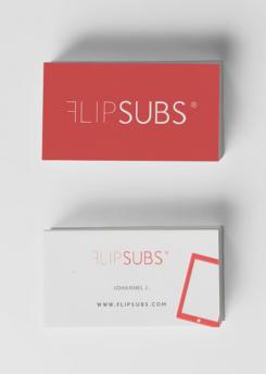
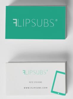
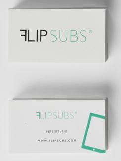
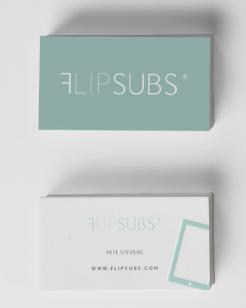
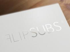
How it could look on a bussines card
FlipSubs - New digital newsstand
- Contest holder: Johannel
- Category: Logo design
- Status: Ended
Start date: 03-04-2014
Ending date: 17-04-2014
It all started with an idea...
A short, interactive guide helped them discover their design style and clearly captured what they needed.
Brandsupply is a platform where creative professionals and businesses collaborate on unique projects and designs.
Clients looking for a new logo or brand identity describe what they need. Designers can then participate in the project via Brandsupply by submitting one or more designs. In the end, the client chooses the design they like best.
Costs vary depending on the type of project — from €169 for a business or project name to €539 for a complete website. The client decides how much they want to pay for the entire project.
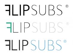
Hi Kimberly, we like the F that is flipped. Can you make the flipped F more prominent; change the background to white, create a logo from the name only (not business card look)and change the font?
Can you also try the effect on a couple of colors?
of course! I will post it as fast as possible. Thanks for the feedback.
Different combinations can give it a whole new touch
Example with a lighter color and different font
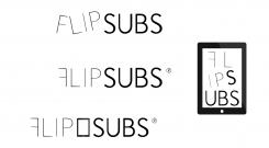
I positioned the Logo that I chose in the middle. Some other ideas that came to my mind are around it. Hope you enjoy my idea!
I like the middle one. Can you change the font? Swop the boldness around in one example. Bold only the flipped F in another and do these in different colors. Try the F in blue; lip in black and subs in a dark shade of grey. Let see how it looks
 Nederland
 België
 France
 Deutschland
 Österreich
 International
