No comments
JD3, the deadBEAT rapper
- Contest holder: jd3thedeadBEAT
- Category: Logo design
- Status: Ended
- Files: File 1, File 2, File 3
Start date: 12-11-2016
Ending date: 26-11-2016
It all started with an idea...
A short, interactive guide helped them discover their design style and clearly captured what they needed.
Brandsupply is a platform where creative professionals and businesses collaborate on unique projects and designs.
Clients looking for a new logo or brand identity describe what they need. Designers can then participate in the project via Brandsupply by submitting one or more designs. In the end, the client chooses the design they like best.
Costs vary depending on the type of project — from €169 for a business or project name to €539 for a complete website. The client decides how much they want to pay for the entire project.
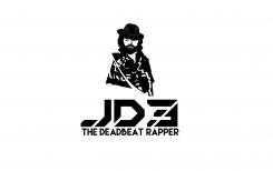
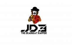
I have his old Poncho Back :)
with regards Petje
Thank You Jd3thedeadBEAT
:)
regards Petje
No comments
I like the hat now. Looks great. I liked the poncho the way it was before, though. Feel free to change it up or mess around with it, but the way it was before is fine.
Hoi Dank U wel jd3thedeadBEAT
ik ga hem aanpassen
met vriendelijke en creatieve groeten Petje
No comments
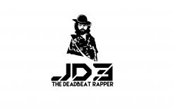
I like it, but can we make the hat look a little more like a panama style hat. Also can we get a little more tilt to add a little mystery to the character? Thank you!
The hat just doesn't look even to me. That's really the only thing I think could be improved. It needs to maybe sit just a little lower with the same amount of tilt.
It should be facing forward with a slight tilt down and to the right.
No comments
Ja! Goed werk. Ik voorzie dat dit een eerste keuze bij het team. Dank je. We houden u op de hoogte.
Hoi Dank U wel jd3thedeadBEAT
met vriendelijke en creatieve groeten Petje
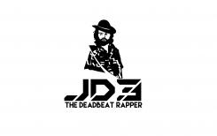
Can you work on the hat a little? I like the way it's tilted, but could you make it a little more realistic/detailed like the most recent submission.
Hoi jd3thedeadBEAT
ik ga hem aanpassen
met vriendelijke en creatieve groeten Petje
Hoi jd3thedeadBEAT
Ik zie dat er meer kleuren in gebruikt zijn in die nieuwe inzending dat effect kan ik moeilijk na bootsen met alleen zwart daarvoor gebruikt hij ook meer kleuren
met vriendelijke en creatieve groeten Petje
No comments
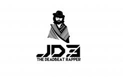
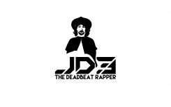
I think we should stick to the all black and white. I don't think that paisley design is fitting in well. Could it be more tribal like in the attached photo with the poncho. Also, tone down the thickness of the hair toward the hat. Hair and beard should be similar to this link:https://www.google.com/search?q=jim+morrison&espv=2&biw=1344&bih=781&source=lnms&tbm=isch&sa=X&ved=0ahUKEwjd8I-GvaPQAhXFdSYKHUcpBUcQ_AUIBigB#imgrc=jXE5dxLYRXTiqM:
Thank you for working on this with me. You're on the right path.
also, if you you could focus a bit more on the hat. If it could sit on the head similar to the one in this picture, but I don't want the top of the hat to be as tall as in the picture.https://theunwrittenrecord.files.wordpress.com/2013/11/406-nsb-011-billykid.jpg
No comments
Good first draft. I like the black and white, and i like the direction you are going with the JD3 tex. Hat looks more like a sombrero in your design. It should be more like the hat attached and sitting flat on the head. Also, if you could design the poncho in color with tribal/paisley pattern. Also JD3 should be centered undeneath, and the poncho should not be parting in the middle. it should almost be thrown over the shoulder kind of like a scarf. Great first draft. Enjoy the direction you are headed.
 Nederland
 België
 France
 Deutschland
 Österreich
 International
