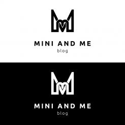
Hi Sharon,
attached the design with the changes you asked for ;) Have a nice sunday, kind regards, Dagmar
Logo - Blog - Classic/basic with an eye catcher!
- Contest holder: Shaki
- Category: Logo design
- Status: Ended
Start date: 06-01-2016
Ending date: 18-01-2016
It all started with an idea...
A short, interactive guide helped them discover their design style and clearly captured what they needed.
Brandsupply is a platform where creative professionals and businesses collaborate on unique projects and designs.
Clients looking for a new logo or brand identity describe what they need. Designers can then participate in the project via Brandsupply by submitting one or more designs. In the end, the client chooses the design they like best.
Costs vary depending on the type of project — from €169 for a business or project name to €539 for a complete website. The client decides how much they want to pay for the entire project.
Hi Sharon, attached the examples with the subline more slanted and stronger lines for the image sign. Let me know, if you need more adjustements in any way, kind regards, Dagmar
No comments
Please find my feedback on the other designs. Thanks
No comments
I still prefer the artwork in the third option, the most basic one but maybe play a little with the thickness of the lines and keep the distance of the two M's to make it clear the two heart are the two M's. The handwriting can be more slanting and smaller. Thanks again!
Hello Sharon,
attached the new variations with the callygraphic fonts, kind regards, Dagmar
Thank you for the upload. I'm not sure about the signature, regarding the artwork I don't like the two hearts this way.
Good morning Sharon,
attached a new combination for the image sign, looking forward to your reply, kind regards, Dagmar
No comments
Can we integrate the artwork a little more in the design. So a little smaller and maybe in front of my signature? Or somewhere in the middle. Now it is a little to big I think. Tx
No comments
Thank you again! I like the artwork very creative! The font of the blog name is still not what I'm looking for, the same for my signature. I want to show you an other font via email are you open for that? Please let me know.
Hy Sharon,
sure, send me the link ;) to info@virtual-lies.de, and I will improve the design with another font style. Kind regards, Dagmar
Good morning Sharon,
thank you for your feedback. Attached new revisions of my previous proposals in thinner lines and different typography. Looking forward to your reply, kind regards, Dagmar
No comments
I like the idea of the two M's coming together and create a small and big heart! Same feedback as below, I prefer fine lines in the logo and a more "stand out of the crowed" font for the blog name. Please add a handwriting font to my signature. looking forward to a next step. Thanks
Can you maybe change the font of this design to the one I have send you for the name and signature. Keep to logo like it is but make it a little smaller. TX
Can you maybe change the font of this design to the one I have send you for the name and signature. Keep to logo like it is but make it a little smaller. TX
No comments
Hello Sharon,
attached my first idea for your logo competition. I tried to keep it simple, just combined the small and big letters M to visualize the "MINI AND ME". The two letters also form an abstract heart, that shall show your passion for your work and kids. Looking forward to your feedback, kind regards, Dagmar Lange
Thank you for your design. I like your idea but a like to see fine lines instead of the fat lines. The font is to basic and I like to see my signature in a handwriting style. Thanks!
 Nederland
 België
 France
 Deutschland
 Österreich
 International
