Logo design - Apartment rentals in Brazil and abroad

Start date: 06-05-2015

Ending date: 31-05-2015

Total budget: € 329.00
WINNER
Book cover
krisi

It all started with an idea...

A short, interactive guide helped them discover their design style and clearly captured what they needed.

Needs


We have invested in beachfront apartments in Fortaleza, Brazil. We created a website to rent them for vacation rentals, like a hotel reservation website.

Currently we totally change the graphic design, so we need to make sure our logo will match our new website.

In the future, it is possible that we invest in new apartments, still seafront and in prime locations, but not necessarily in Brazil. This is why the logo doesn't have to be attached to a particular country.

It should reflect: holiday (the scenery and relax, but also the party), the exotic, but also seriousness. We are investors, with staff on hand to greet customers in a professional way, we aren't amateurs.

Thank you to check out the links in "Color, favorites and other requirements" to know more about the graphic requirements.

Company description


Our apartments are located on the most beautiful avenue of the city, beside the beach and shops. They are located in an hotel residence, which means that our customers can have the freedom of a fully equipped apartment with kitchen, or be offered traditional hotel services (catering, daily housekeeping, sports facilities ...).

Target group


Our price positioning focuses on the medium range, our customers are mainly couples aged 30 to 50, traveling for leisure or even business. They generally come from Latin America and North America, more rarely in Europe, but as announced in "Need", the logo should not be restricted to the geographical area of Brazil.

Colors, favourites and other requirements


1) The logo must contains the name "Seaflats", the font used should be modern;
2) We must be able to add ".com" when we will use the logo in promotional videos (see attached);
3) It must be visible preferably on white background but also on black / dark / colored one;
4) No representation of people in the logo or commonplace like earth / globe / world with an airplane ... We are not travel agents but investors, owners of apartments;
5) Regarding colors, they must match with the new design, but not necessarily tone-on-tone either. The logo can be colorful, vivid, it must express the joy of life, the pleasure of discovering new horizons. In short, an invitation to travel;

To see the old logo on the former site: http://seaflats.com/seaflat_v_3_002.html and to see the second booking site (the two sites will be merged and thus revised): http://bookinghotelflats.com /

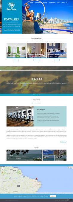
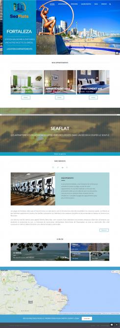
-> IMPORTANT: to see some visuals of the new website and the location of the logo: http://we.tl/OJ3qbuf20c or view files attached to this presentation (in French but it's the visual that matter).

Designer: krisi krisi
logo-krisi-uZpYTbaS

No comments

This contest is finished. Its not possible to reply anymore.
logo-krisi-vC9HHTyS

No comments

krisikrisi

Hello,
here two version with .com

Regards,
Krisi

This contest is finished. Its not possible to reply anymore.
logo-krisi-KARAMm4u

No comments

This contest is finished. Its not possible to reply anymore.
logo-krisi-Ivnil1Gq

No comments

SeaflatsSeaflats

It's better. Just before the competition ends, could you add a version with ".com" ? Perhaps in a vertical way rather than an horizontal one (or if so, put it on the top or bottom of "Flats").

This contest is finished. Its not possible to reply anymore.
logo-krisi-T151BKaW

No comments

This contest is finished. Its not possible to reply anymore.
logo-krisi-SOlINSAS

No comments

This contest is finished. Its not possible to reply anymore.
logo-krisi-RmRZZZmS

No comments

SeaflatsSeaflats

Pourriez-vous insérer également un hébergement de taille plus petite, afin de montrer que tous nos investissements ne sont pas dans des immeubles ?

krisikrisi

Thank you for rating. I will work on it

This contest is finished. Its not possible to reply anymore.
logo-krisi-RA7qlhOS

No comments

SeaflatsSeaflats

Le jaune/orange du mot "Flats" ne ressort pas bien sur le fond bleu du site que vous avez inséré dans une autre image. Auriez-vous une autre variation de cette teinte à nous proposer ?

This contest is finished. Its not possible to reply anymore.