No comments
Logo for IT Heroes
- Contest holder: pitr
- Category: Logo design
- Status: Ended
Start date: 19-10-2013
Ending date: 16-11-2013
It all started with an idea...
A short, interactive guide helped them discover their design style and clearly captured what they needed.
Brandsupply is a platform where creative professionals and businesses collaborate on unique projects and designs.
Clients looking for a new logo or brand identity describe what they need. Designers can then participate in the project via Brandsupply by submitting one or more designs. In the end, the client chooses the design they like best.
Costs vary depending on the type of project — from €169 for a business or project name to €539 for a complete website. The client decides how much they want to pay for the entire project.
Hi bobgun,
Can you make the bottom 'i' more in line with the hexagon? It is a bit rounded too much right now :) Thanks!
Hi Pitr,
Here you have your final version :) http://www.behance.net/wip/329765/618321
Thanks
No comments
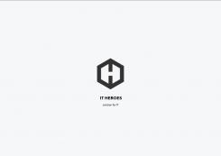
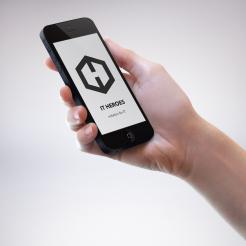
Hi, this is my final version of the logo, it's minimalist, clean and yet with well -thought-out details. It is a cube shown as a hexagon which refers not only to "thinking out of the box" but at the same time it is still like a Rubik's cube with hidden symbols. I depicted letter "T" as an arrow on the top symbolising speed, power, higher rationality. You can find "T" also on the sides of the hexagon. Letter "I" symbolise a power button. Overall, it is simple and yet sophisticated resembling hero emblem.
Hi Bobgun. This new approach is very impressive!
Hi bobgun - this logo is too similar to www.facebook.com/tokyohive
Hi Pitr, thank you a lot for your comment and share. Well, I have never seen the logo you sent me before. When creating it, I had my purpose as described above and gave the hexagon shape its own distinctive definiton keeping in mind your requirements for a hero emblem. I wanted to make it minimalistic in one colour but changing colours of some features of the logo could make it more distinguishable.
Right now it is unacceptable as a logo, even though it looks great.
No comments
Subtle! Can you elaborate on the previous logo?
No comments
Can you elaborate on this logo?
No comments
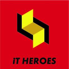
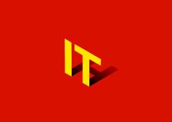
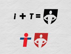
Hello, this is my iconic design. I merged letters "I" and "T" to create a "hero". I would appreciate your feedback.
 Nederland
 België
 France
 Deutschland
 Österreich
 International
