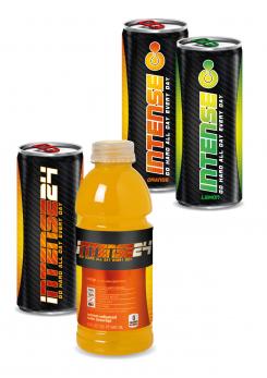
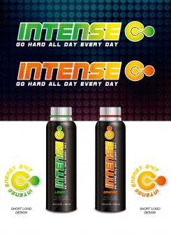
Here the logo's on a can and a bottle.
Note: The designs in the background of the can and the bottle are just an impression of what it can be.
Kind regards,
Dries
Natural Energy Drink
- Contest holder: Bdavid
- Category: Logo design
- Status: Ended
Start date: 30-10-2015
Ending date: 13-11-2015
It all started with an idea...
A short, interactive guide helped them discover their design style and clearly captured what they needed.
Brandsupply is a platform where creative professionals and businesses collaborate on unique projects and designs.
Clients looking for a new logo or brand identity describe what they need. Designers can then participate in the project via Brandsupply by submitting one or more designs. In the end, the client chooses the design they like best.
Costs vary depending on the type of project — from €169 for a business or project name to €539 for a complete website. The client decides how much they want to pay for the entire project.
Just Fantastic. The competition is strong but I like this..the rest of the team will have a view naturally
Hello David,
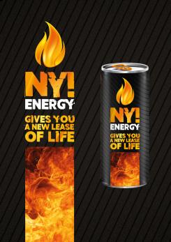
Here another proposal
Kind regards,
Dries
Hello David,
Here some proposals for the slogan.
Hello David,
Concerning the discussion about the logo. I hadn't noticed the similarities with the other candidates. I do not wish to participate in that discussion who did what first. I think that's childish, I'm too professional for that. If you want, I will remove the logo from the competition.
Kind regards,
Dries
Hello David,
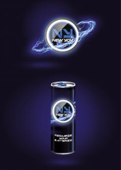
Here a proposal for the NY logo.
Yes this is pretty cool. One to think about!
Hello David,
I can't resist to make another logo for you. So here it is, together with some color variations.
Thanks for your respons.
I can't resist to advice you to choose another type font, because I already use it in my proposal...
What you do now is: Krisi + 7 Men = ddhoore
This is total stealing! Change your font!!
BTW Really original lightning!
Ok guys your comments have been considered so let's not have this back and forth, we can address this topic if this was the winning design.
Hello David,
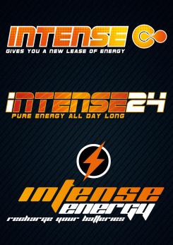
Attached you can find another proposal for the logo. A blue one and a red/orange one with an extra "24" on the end of "Intense".
Thanks for your respons.
Have a great sunny sunday,
Kind regards,
Dries
Excellent
Hello David,
Please find attached a proposal for your energy drink logo. I have made a variation on the taste of the drink and a short logo design, or a 24/7 stamp.
Thanks for your comments.
Kind regards, Dries
This is an excellent start I'll get back to you with comments from the team
What does the 24/7 logo represent like to understand the ideology if any
Thanks for your positive respons. I'm looking forward to your comments.
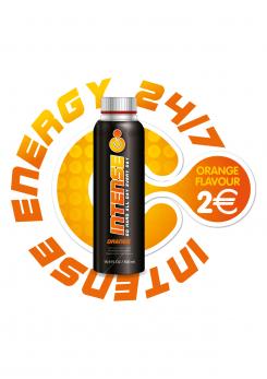
You can use the small logo on places where you don't have enough space for the lardge logo: for example on small online advertisements, on top of the cap of a energy bottle, as a floorsticker in shops. You can also use it as the price stamp (see image) Lots of possibilities.
Kind regards,
Dries
Oh yes great idea I like that - but what I was actually asking what is the inspiration of the short logo does it represent anything or inspired by something or is it just pleasing on the eye.
This is a logo that represent on one side the energy, you get the power out of you, you come out of the circle, the circle that stand for "all day long", and it's also dynamic. On the other side is't, like you say, pleasing the eye.
(sorry for my english)
Ok cool
 Nederland
 België
 France
 Deutschland
 Österreich
 International
