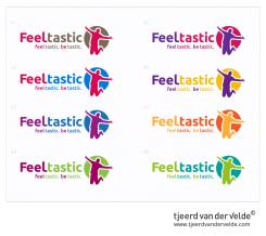
The different color schemes, of course editable to your preferences...
new brand is looking for a mondern logo
- Contest holder: schmio
- Category: Logo design
- Status: Ended
Start date: 26-03-2014
Ending date: 14-04-2014
It all started with an idea...
A short, interactive guide helped them discover their design style and clearly captured what they needed.
Brandsupply is a platform where creative professionals and businesses collaborate on unique projects and designs.
Clients looking for a new logo or brand identity describe what they need. Designers can then participate in the project via Brandsupply by submitting one or more designs. In the end, the client chooses the design they like best.
Costs vary depending on the type of project — from €169 for a business or project name to €539 for a complete website. The client decides how much they want to pay for the entire project.
wow, really fast respond! great draft - actually the very best one in the contest!!
actually, i prefer the two green ones. whats your opinion? and what do you say to the type? can you also make some diffent type-schemes?
My opinion is the V3 (purple blue) or the V8 (greens), but it's up to you, what kind of type-schemes do you prefer? playfull or more business-like
agree with v3 and v8.
hmm would prefer more business-like! our usp is more on the businesssite...
Could you give me the url to your business site?
yeah, unfortunately it is actually under development. :S
but lets try some business types and give you feed asap
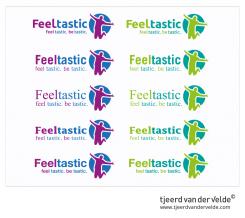
Some type interfaces, they still need some calibration..
ty!
would prefer the first row and the last one
after you, which "l" ist the better one? just a bar or a bar with a crossbar? i am not sure atm
i think it does'nt really matter, it depends on the big picture. In this case i probably would go for the last type..
feel tastic, Be tastic! These words fill my creativity and i see a jumping person releasing all his (happy) emotions. I've converted this feeling into a modern useable logo, that fits different media. The brand design works perfect in large and small scale and is useable on different products/ fabrics. I hope i can inspire you with my design!
Friendly regards,
Tjeerd van der Velde
i really like this jumping person! it really stands for the emotions.
i would prefer, if the "feel" and "tastic" are in different colors - as the second picture. the logo is fine...maybe we can try other color combination to see which is the best one.
best regards,
oliver schmidt
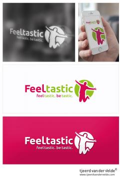
No problem i will make some new colorschemes. The "feel" and "tastic" in two colors is the general idea, the picture in the corner shows a preview of window advertising, and the picture below is just a preview how the logo works on a different background color. It's always smart to test the logo in one color, so in the future u will have no problems with it.
thank for your respond and information. i am really looking forward for your new schemes.
 Nederland
 België
 France
 Deutschland
 Österreich
 International


