Old style - new options.
New logo Amsterdam Welcome - an online leisure platform
- Contest holder: AmsterdamWelcome
- Category: Logo design
- Status: Ended
- Files: File 1, File 2
Start date: 15-02-2017
Ending date: 03-03-2017
It all started with an idea...
A short, interactive guide helped them discover their design style and clearly captured what they needed.
Brandsupply is a platform where creative professionals and businesses collaborate on unique projects and designs.
Clients looking for a new logo or brand identity describe what they need. Designers can then participate in the project via Brandsupply by submitting one or more designs. In the end, the client chooses the design they like best.
Costs vary depending on the type of project — from €169 for a business or project name to €539 for a complete website. The client decides how much they want to pay for the entire project.
3rd logo variations (composition)
The top logo we like the best so far. We are still wondering if you could make one more option including Welcome in a similar style as the old logo?
Dear AmsterdamWelcome team,
thank you so much again.
Did you mean that I create a similar letter type as the old logo in the word Welcome, or something other?
Regards,
m3kdesign
Handwriting font with continuing (No space between letters).
Two versions. In both of them I made a less sharp bottom edge The different is in circle around the letter "i".
Hope is better now.
Kind regards,
m3kdesign
No comments
Thank you for this. Could you make the pointer less sharp so in between the first and second option and in style of the third option without any icons. And could you make another option with Amsterdam in blue and the I in gold but than a one tone matt finish gold?
One question: In second opnion do you want to make word Welcome in matt gold instead a word Amsterdam, or everything on blue (Amsterdam and Welcome)?
Would you also be able to give us a couple more options with the above and than Welcome in connected handwriting, so without leaving the paper.
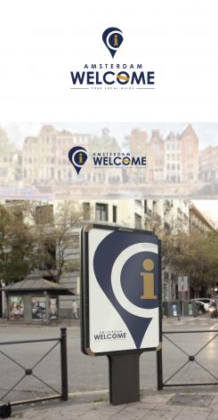
The 3rd option the I really graps the attention. Is there a way you could present us with some variations on this logo?
we would like to see Amsterdam en Welcome both in blue. Thank you.
Of course! I will prepare something for you.
Thank you so much for your rating and construcitve feedbacks.
Here are a two new versions. First with incorporated a orange colour, and second without.
Hope that "I" now is looking better.
Regards!
m3kdesign
Dear sir/madam,
it is my pleasure to participate in your contest.
This is my first vision and preview pack.
If you have some suggestions, please feel free to contact me.
Hope that you like it.
Best, best regrads,
m3kdesign.wix.com/portfolio
The logo looks nice! The only thing we are still doubting about is the pointer with the windmills on top. The I doesn't grab the attention as much as we'd like. Would you be able to add a version which makes the I stand out more by leaving the houses behind or adding de I in a different colour?
Dear M3kdesign,
One more question. Is it possible to see the pointer in a more google pointer style?
Kind Regards,
Amsterdam Welcome
Dear M3kdesign,
Thank you for the quick changes! We like the logo with the google pointer but feel the round shape around the I and outlined to the right side in version 1 is more unique. Would you be able to make a version which includes the google pointer but with the content the same as in version 1 and could you maybe change the icons to something like a tulip / bicycle / Amsterdam houses? We are not sure yet if it would be too busy so could we maybe also see it without the icons just the pointer with the circle and the I? And is it possible to make the font of "Welcome" only a little bit more graceful? Lastly, would it be possible to make the shape around .info a bit slimmer? We really appreciate your work. If you need further information please contact us via http://www.amsterdamwelcome.info/.
Kind Regards,
Amsterdam Welcome
Thank you. Done!
Please choose one of the font you like it the most, and if you want a colour combination of the bottom on page.
Thank you again.
m3kdesgin
After seeing the font options we seem to like the very first logo the most with your picked font. With version 1 as a starting point, could you make two versions one with the second style pointer and one with your pointer and change the icons to the last created tulip/bicycle/houses horizontal at the top. And would you be able to make a third version without icons at all. And if possible a fourth version including the I in gold.
Thank you.
Kind Regards,
Amsterdam Welcome
Of course! Thank you.
 Nederland
 België
 France
 Deutschland
 Österreich
 International
