No comments
young makeup artist needs creative logo for self branding
- Contest holder: Miracle Look
- Category: Logo design
- Status: Ended
Start date: 10-07-2020
Ending date: 24-07-2020
It all started with an idea...
A short, interactive guide helped them discover their design style and clearly captured what they needed.
Brandsupply is a platform where creative professionals and businesses collaborate on unique projects and designs.
Clients looking for a new logo or brand identity describe what they need. Designers can then participate in the project via Brandsupply by submitting one or more designs. In the end, the client chooses the design they like best.
Costs vary depending on the type of project — from €169 for a business or project name to €539 for a complete website. The client decides how much they want to pay for the entire project.
Hello,
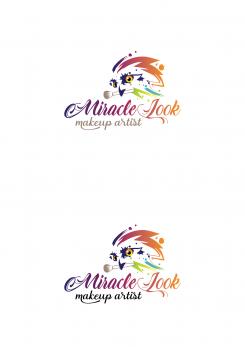
What do you think about this color for "makeup artist"?
No comments
Thank you so much!
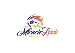
The owl looks really SUPER now!
I like the color gradient at "makeup artist" very much, but I am afraid that the yellow color could no longer be legible on a business card.
Last change request: Can you try out the color gradient in the turquoise blue to green, which also occurs in the owl?
Thank you so much!
best regards
Martina
No comments
Hello,
here adjusted logo :) Let me know if I can be more helpful.
Regards,
Krisi
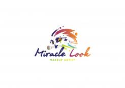
I'm really sorry I'm so annoying ... I also liked the version with the missing blob on the left eye. I also wanted to have the blob removed from the other eye as well. Sorry, but maybe I just put it into wrong words :-(
Thank you so much!
Don't worry at all!! I didn't undesrtand correct :) I upload new version without both "blobs" . Let me know if I can do something more for you
No comments
Hello,
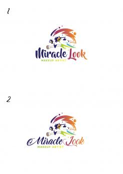
I remove the "blob" under the right eye...that's correct?
And I make Mekeup artist in two version... one is like small black contour and second one is only with gradient.
Let me know what do you think.
Regards,
Krisi
Hello!
Sorry for the late reply.
Thanks for the changes!
Because of the blob: I actually meant the other eye - please remove the "stain" from the other eye if possible :-)
Because of the font: I like the lower variant without a border better - thank you.
Kind regards Martina
No comments
Hello,
here adjusted logo... I think it look better with brush color for "makeup artist".
Let me know what do you think.
Regards,
Krisi
Hello,
I really like the changes made to the font!
When it comes to the color at "makup artist" I'm still undecided which variant I like better. I will let that affect me a little :-)
Ok... Let me know if you want to see some other color :)
Hello,
I might still have a few little things.
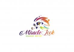
Can you remove the purple "blob" next to the owl's right eye? In the "Thumbnail" it looks like the owl is squinting :-)
I would like to see the new font at "makeup artist" with the original color gradient. Can you then border them very thin black?
What do you think about this idea?
Thank you so much!
best regards
No comments
Hello,
I adjust "L"letter so now didn't look like "J" and I make gradient in "Miracle Look".
Let me know if I can be more helpful.
Regards,
Krisi
I like it better, but could you make the lower line of the L a little thicker and more curved?
Would it be possible to change "makeup artist" in a delicate, curved font and in the same color as the brush?
Thank you!
best regards
Martina
or "makeup artist" maybe in black?
No comments
Hello,
Here two more fonts version.
Let me know what do you think.
Regards,
Krisi
Hello,
Thank you very much!
I like font 2 much better, but the L looks more like a J ...
By the way I love this curved design :-)
best regards
Martina
Hello,
by the way, can you maybe also add a gradient in "Miracle Look"? For example, the word "Miracle" is only purple in color ...
best regards
Martina
No comments
Hello,
Thank you for your feedback!
Here adjusted logo. Let me know what do you think and if I can be more helpful.
Kind Regards,
Krisi
Hello,
thank you!
I like it much better than before.
But the font is still not quite what I imagine it to be. The playful, sweeping has already been good, only the i-point just disappeared in the M ...
Maybe you find another one?!
Best regards
Martina
No comments
Hallo,
das ist genau die Kreativität nach der ich gesucht habe :-)
Farben top!
Mit der Schriftart bin ich nicht zufrieden (I-Punkt verschwindet in der Schleife des M).
Der Schnabel der Eule ist etwas zu spitz und der Pinsel geht farblich leider etwas unter.
Kann man das vielleicht noch ändern?
Danke!
lg Martina
 Nederland
 België
 France
 Deutschland
 Österreich
 International
