No comments
Logo design for a (non-profit) extrem sports website
- Contest holder: -Sebastian-
- Category: Logo & stationery
- Status: Ended
Start date: 15-02-2014
Ending date: 15-03-2014
It all started with an idea...
A short, interactive guide helped them discover their design style and clearly captured what they needed.
Brandsupply is a platform where creative professionals and businesses collaborate on unique projects and designs.
Clients looking for a new logo or brand identity describe what they need. Designers can then participate in the project via Brandsupply by submitting one or more designs. In the end, the client chooses the design they like best.
Costs vary depending on the type of project — from €169 for a business or project name to €539 for a complete website. The client decides how much they want to pay for the entire project.
Cool...
Hi luckydesign! I think you made it ;-) I like your design very much. But after a few days I think I like the logo without the pinion most.
So I think everything we have to do is to sum up:
Logo:
The "6" without the pinion and the following letters:
THE NEW
SIXSECTIONS
TheNew.SixSections.com
BC:
Can I get the BC as a Word-File or in any other editable file type to change my address details if possible?
Extra question:
Which font did you use for the logo? So I can use it for the headlines of the web site.
PS: This is my first project on brandsupply. How does it work, that i can make you the winning designer tomorrow? Will there be a pop up for me?
Hello lucky design. Nice job . cheers .
Have to agree with soy, nice work - keep it up.
Congrats.
No comments
Dear Sir
I had submitted the desire changes.
Also tell me your Information for business card so that I can presents you a business card design.
Best Regards
Lucky!
Looking good!
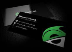
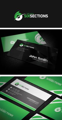
For the BC: I like glossy ones (green/black). For the BC I would prefer the logo without the URL.
The data for the Layout test is:
Name: Sebastian Schmidt
Position: Chefredakteur|editor-in-chief
Mail: Schmidt@SixSections.com
URL: http://TheNew.SixSections.com
Phone: +49(0)176-62986107
No comments
That's cool! But I think the teeth of the pinion should be outside of the radius of the round body of the "6". The rest is perfect!
I would like to have the URL in the Logo as well
http://TheNew.SixSections.com. Probably it is possible to have it in little Letters under the SIXSECTIONS letters? What do you think?
No comments
Well done. I like this design! Is it possible to have a pinion as the white part of the logo? To make it look more like a bike logo?
And is it possible to make the "6" just a little more visible?
Dear Sir
Thanks for appreciation
I will soon submit the desire changes.
Best Regards
Lucky!
For the BC: I like glossy ones (green/black). For the BC I would prefer the logo without the URL.
The data for the Layout test is:
Name: Sebastian Schmidt
Position: Chefredakteur|editor-in-chief
Mail: Schmidt@SixSections.com
URL: http://TheNew.SixSections.com
Phone: +49(0)176-62986107
 Nederland
 België
 France
 Deutschland
 Österreich
 International


