No comments
New brand is looking for logo and corporate identity
- Contest holder: Cyffer
- Category: Logo & stationery
- Status: Ended
Start date: 26-02-2014
Ending date: 26-03-2014
It all started with an idea...
A short, interactive guide helped them discover their design style and clearly captured what they needed.
Brandsupply is a platform where creative professionals and businesses collaborate on unique projects and designs.
Clients looking for a new logo or brand identity describe what they need. Designers can then participate in the project via Brandsupply by submitting one or more designs. In the end, the client chooses the design they like best.
Costs vary depending on the type of project — from €169 for a business or project name to €539 for a complete website. The client decides how much they want to pay for the entire project.
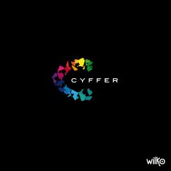
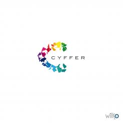
I worked on a personal typography created just for your logo. I changed the color combination with a gradient style.
The C is the same but with no shards.
I hope you will appreciate it.
I stay at your beck and call.
Sincerely
Wilko
Hi remy,
Thank you for your feedback.
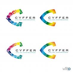
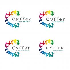
here is 4 differents design.
He Wilko,
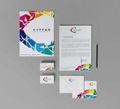
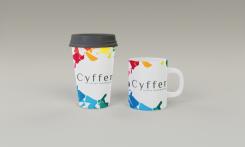
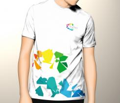
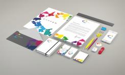
We like the logo you designed in the top left corner the most. The space between the shards and the bold font is much better. Can you use this style to make a new design for: the writing paper, follow-up paper, envelope and business cards. I will send you a personal message containing my personal e-mail address so we can correspond directly.
Regards,
Wouter
Love the design Wilko ;)
Thank you Matviews, I really appreciate :)
When I look at the score and the comments of the client ...
Congratulations Wilko!
4 +
Hi Remy,
I didn't mention it but I don't speak dutch. I translated and I think I understood what you want. First of all, I am glad you like my design. This is a modern and distinctive logo which will create a strong brand identity. As you wish I changed the font and add the baseline "online dashboards". I give you 4 different font.
I look forward your feedback and I stay at your beck and call.
Sincerely.
Wilko
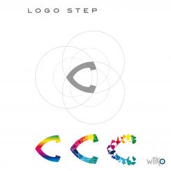
Hello Wilko, thanks for your patience. We prefer CYFFER in capitals like your first designs. Can you give the font in this first design a little bit more body? We are also in doubt about the shards. Can you make an example that's between the last two steps in your "logo step"?
Kind regards,
Remy
No comments
Beste Wilco, we zijn erg onder de indruk van je ontwerp. Kleurig, onderscheidend, modern. Kan je nog wat variëren in het font van "CYFFER" en een descriptor eraan toevoegen. Voor nu werken we even met "online dashboards". Groet, Remy
 Nederland
 België
 France
 Deutschland
 Österreich
 International
