Hello,
the bigger point between „Werving and Selectie“ istn‘t a good idea because the constellation of the two lines in middle position moves by eye the „&“ and „•“ in a very ugly position to each other. Therefore it is not a right centre in this case. I hope You will understand what I mean. A thinner point isn‘t more remarkabel!
What‘s going on with the sheet of note paper? In send three samples, too. We spoke about this case on Friday last week!
If I read your mail from today I suppose that the person who send this mail has no infos about the phonecall from Friday.
Now I‘ m a little bit confused!
Please let me have strict infos/orders.
Yours very truly
Logo & Stationary Design for Recruitment Agency
- Contest holder: molenaarderooij
- Category: Logo & stationery
- Status: Ended
Start date: 07-04-2014
Ending date: 17-04-2014
It all started with an idea...
A short, interactive guide helped them discover their design style and clearly captured what they needed.
Brandsupply is a platform where creative professionals and businesses collaborate on unique projects and designs.
Clients looking for a new logo or brand identity describe what they need. Designers can then participate in the project via Brandsupply by submitting one or more designs. In the end, the client chooses the design they like best.
Costs vary depending on the type of project — from €169 for a business or project name to €539 for a complete website. The client decides how much they want to pay for the entire project.
No comments
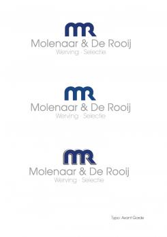
Hello! Our preference is the first one of the three designs on the left! We only prefer the dot between the words Werving & Selectie to be bigger. Just as you did in the stationary. Can you make that change? I will also give you my feedback on the stationary today.
Hello,
bus card will follow if the logo have been fixed
Yours very truly
No comments
Can we please have a call so we can discuss next steps. Please let us know where we can reach you. Thanks.
Goodmorning, we really need to move forward with the creation of our logo. Can you pls get in contact. Thank you.
You will reach me today until 11.00 a.m.
LÄMMRICH DESIGN
Schlossgasse 5
96484 Meeder
Tel. +49 9566 807981
Fax + 49 9566 807982
laemmrich@t-online.de
http://www.laemmrich-design.de
Hello,
hoping I understood everything.
Kind regards
Hi, not entirely :) Can we call so I can explain better?
Hello,
what do you mean about this logo?
Association: drive, initiative, movement
Attributs which are important for your Recruitment Agency...
and for example the colorful wheel means persons of all colour (metapher for each job the perfect person).
Yours very truly
No comments
Hello! We have selected your design as our winner! We do have some changes we still want to make. In regards to the colour of MR, we pref a more dark blue / corporate blue instead of the more purple blue that you used. Can you come up with an alternative. We def pref the font type you've used in the first design, so the one on the left.
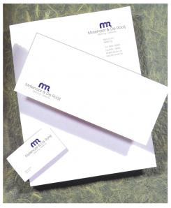
In regards to bus card and letterhead. Can you outline the logo in the middle instead of on the right. We prefer to have our company details at the bottom of the letter head, not in an angle but spread out over the bottom.
In regards to the bus card, can you mock one up with details as below:
Sacha de Rooij
06 150 82 826
sacha@molenaarderooij.nl
molenaarderooij.nl
Brouwerstraat 10
1814 HZ Alkmaar
What are the next steps?
Thanks!
Hello,
attached my design.
Thanks for your short feedback in advance.
Yours very truly
Thank you for your design. We truly like this. Especially the way you've played with the M and R! We pref the first two colours (blue versions). I do think however there are too many font types used. It doesnt seem in balance? Can you make the name and the tagline in the same font? Can you also try one with a more modern font type? Thank you!
Hello, we've provide feedback to you yesterday. Are you interested in submitting revised versions? We are evaluating all designs tomorrow. Thank you.
 Nederland
 België
 France
 Deutschland
 Österreich
 International
