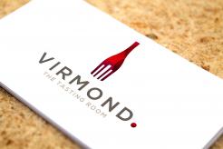
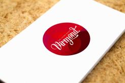
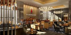
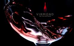
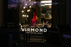
I've added the dot in the logo... :)
Lettering/logo and menu template for restaurant
- Contest holder: mvirmond
- Category: Logo & stationery
- Status: Ended
Start date: 07-07-2013
Ending date: 31-07-2013
It all started with an idea...
A short, interactive guide helped them discover their design style and clearly captured what they needed.
Brandsupply is a platform where creative professionals and businesses collaborate on unique projects and designs.
Clients looking for a new logo or brand identity describe what they need. Designers can then participate in the project via Brandsupply by submitting one or more designs. In the end, the client chooses the design they like best.
Costs vary depending on the type of project — from €169 for a business or project name to €539 for a complete website. The client decides how much they want to pay for the entire project.
great - I like it a lot!
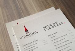
could you draft the 1-page menu on that basis?
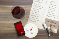
Ambiance mock-up of wine glasses on the table
Hi Marius,
Here you see the concept logo for "Virmond. The Living Room". I've chosen to work with a script font to achieve a home like, warm atmosphere. I've used the dot from The Tasting Room logo to show the connection between the 2 restaurants in a very subtle way. How do you like it?
Regards,
Liz
Hi Liz, thank you for the design. I can see the connection between the two, and I can also see why you changed the font. however, I would really like to see a closer connection between the two.
It doesn't need be very different. Could be as simple as using a different color. maybe a slightly different logo (since the "living room" is more about eating a soup or having a coffee, not quite so much about wine & dine). Or it could even be the same logo.
same with the font. I wouldn't go for something completely different. could be the same or something similar.
As a further explanation: I would love to be able to use this both as a joint brand as well as a brand for each room. They are right next to each other, so I would like to make it very visible that they belong together, even if they have a different product offering.
In any case, I can see you have plenty of talent for this - your design look very professional and beautiful.
Kind Regards,
Marius
Hi Liz,
are you still on to this?
I still very much like your design for the tasting room - in fact, it continues to be my favorite. But it doesn't quite work for me without the matching design for the living room...
Kind Regards,
Marius
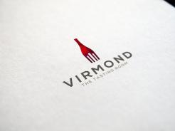
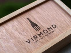
Hi there! With these designs I'd like to compete in the pitch for Virmond! I've created a modern, classy logo of a wine bottle that also represents a fork. Also made a couple of mock-ups to show the ambiance I want to achieve. I really hope you like it and I'm looking forward to your feedback!
Kind regards,
Lisette
Marvelis.nl
Dear Lisette. I like it a lot!
Very classy, simple, yet fun.
One small thing: We intend to spell the name "Virmond."
Almost everyone seems to overlook the "."
I could really see this work for the tasting room.
What about the living room? Wine is not really a topic there.
It would need a different design I suppose.
Finally, one thought: We previously designed a logo for a brand called essense. it also had a fork on top, which was slightly "lifting up" one of the letters. Made it kind of fun. see www.essense.ch
I could imagine this here as well (maybe?!).
Cheers
Marius
Gutenabend Marius!
Thanks so much for your great comment and feedback. I'm going to make an additional logo door the Living Room and will add the "" quotes to both logo's.
I've looked at the Essence logo and I like its playfulness, but I think a sharp logo design suits the restaurants better. A bit more stylish, if you know what I mean.
Greetings from Amsterdam,
Lisette
Marvelis.nl
In september I'm going on holiday to Switzerland, how funny! My parents live near Chur and I visit them as much as I can. I love your country!
sounds great! looking forward to your proposal.
just so there's no misunderstanding. the spelling is not about ""quotes. It'a about the .
Virmond.
not Virmond
no quotation marks please...
thanks again
the area around chur is a really beautiful place - enjoy!!
Oh I see... Virmond. Excellent! :)
I'll go right to work!
Hi Marius,
I'm still in! I'll be designing a concept for the menu this afternoon and also edit the Living Room logo.
Sunny greetings,
Lisette
Last but not least...I'm working on the Living Room logo as we speak. Hang in there! :)
ambience pictures look great so far!
 Nederland
 België
 France
 Deutschland
 Österreich
 International
