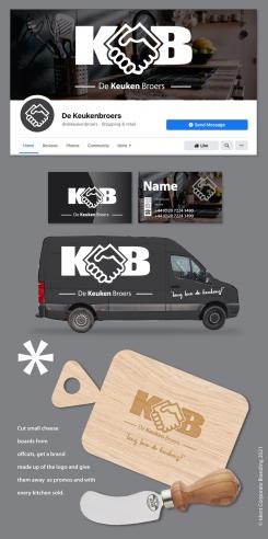
B&W
Brand design for business card and Facebook
- Contest holder: DeKeukenbroers
- Category: Logo & stationery
- Status: Ended
- Files: File 2
Start date: 29-04-2021
Ending date: 23-05-2021
It all started with an idea...
A short, interactive guide helped them discover their design style and clearly captured what they needed.
Brandsupply is a platform where creative professionals and businesses collaborate on unique projects and designs.
Clients looking for a new logo or brand identity describe what they need. Designers can then participate in the project via Brandsupply by submitting one or more designs. In the end, the client chooses the design they like best.
Costs vary depending on the type of project — from €169 for a business or project name to €539 for a complete website. The client decides how much they want to pay for the entire project.
No comments
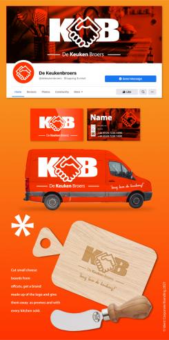
Hi there! is it possible to have a less 'screaming' color? Perhaps black with a black van etc?
Thanks a lot!
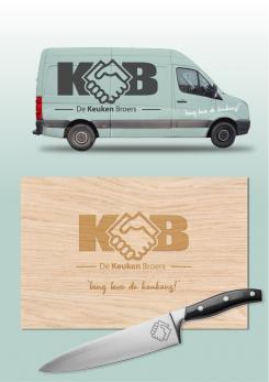
Van 'Wrap', Chopping board and chefs knife.
Hi Please find as requested. However I am a bit concerned that to put the title into three lines makes the logo too busy as the logotype and handshake are the main 'hero'. May I suggest keeping it in one line but emboldening keuken or emboldening and capitalising to accentuate. Regards Alex
I don't understand you say I am in the top 3 and I make the amends YOU REQUESTED as well as offering an industry standard alternative and I don't even get a star. I would hate to think you have been wasting our time. A
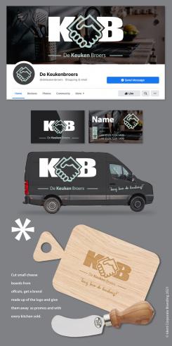
DUCK EGG BLUE.
I draw your attention to the flexibility of this logo. The handshake or logotype (handshake with AK) can be used independently. For hot branding etc. It also only contains solid colour and would transpose into B&W easily without losing communicative value. Thank you cor considering ICB we await your response so that we might provide the best possible solution for your purposes. Alex
Hi there! thanks a lot! currently you are in the top 3, together with sign_ninetyfive and -sandra(especially the branding and our name split in 3 lines(it gives the accent to the keuken(kitchen) part.
Can you perhaps combine these logos? Appreciated!
No comments
Hi I don't understand why this has received three stars but the original scored four. Could you provide feedback.
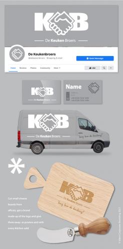
Colour is up to you but I recommend a neutral grey.
No comments
Hi there! we do like the handshake, however we do have some feedback. Is it possible to have a handshake without the suits? Also, is it possible to have the logo a bit 'modernised'? Is it possible to have the handshake combined with a K or KB from our brandname?
 Nederland
 België
 France
 Deutschland
 Österreich
 International
