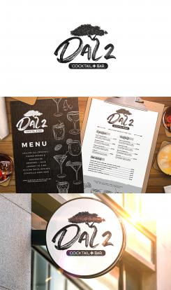
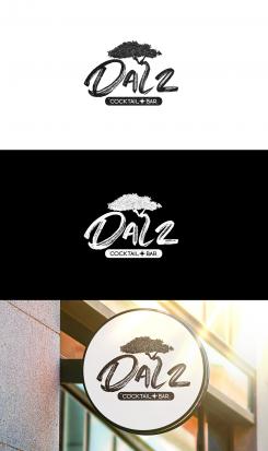
Hello once again dear Sasdiva! I think now that it is better and that number 2 is now number 2 and not Z :)
Looking forward to your feedback, thanks in advance !
Dal 2
- Contest holder: Sasdiva
- Category: Logo & stationery
- Status: Ended
Start date: 22-09-2021
Ending date: 03-10-2021
It all started with an idea...
A short, interactive guide helped them discover their design style and clearly captured what they needed.
Brandsupply is a platform where creative professionals and businesses collaborate on unique projects and designs.
Clients looking for a new logo or brand identity describe what they need. Designers can then participate in the project via Brandsupply by submitting one or more designs. In the end, the client chooses the design they like best.
Costs vary depending on the type of project — from €169 for a business or project name to €539 for a complete website. The client decides how much they want to pay for the entire project.
I have changed the number 2, what do you think is it okay now :) ?
Thank you for your feedback, hope that everything is okay now :)!
Another presentation for you.
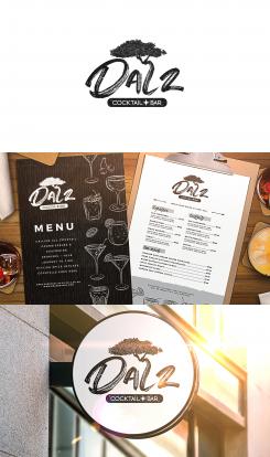
I have also included how the logo would look on cocktail menus in your bar :).
Hi , we love your design but can you change the 2? It looks like a Z
No problem I will be sending you the design today :)
Here is the close look of the logo. Modern, simple, clear and most important very local & beautiful.
I have also tried to make the number 2 look more like number 2 than Z, i think i got it right this time.
Please tell me what you think about the logo, lets get to the final version together :) !
All best, Krstic :)
Laat indien nodig feedback achter voor eventuele updates en wijzigingen, helemaal van jou Krstic.
Local, classy, modern & simple.
Feel free to come back to me for anything that you wish to add/change.
All best, Krstic :)!
This is perfect logo for a backyard cocktail bar.It has a lot of character of Arbua island in it.
Starting from Divi Divi tree that you can see is in letter L.
Than we have a Aruba star put among the Cocktail Bar text.
Simple, modern and yet local logo.
If there is need to change text or anything, please feel free to leave me feedback!
All best, Krsticcc.
Thank you for feedback! Hope we can get to the final logo together, Krstic.
Mooi gepresenteerd. Ziet er al aardig uit. Maar ik vind de '2' teveel op een z lijken en lees daarom Dalz.
Sorry, maar gewoon een vraag, ben jij de eigenaar van deze wedstrijd?
Ik denk dat iedereen duidelijk kan zien dat het DAL 2 is...
Maar ik ga proberen het voor je te repareren, controleer de update die ik heb verzonden :)
No comments
Thank you for feedback! Hope we can get to the final logo together, Krstic.
I made something you will like to see. As you requsted bro, Arubian culture.
There is Divi Divi tree representing letter L.
Then we have Arubian star from the flag. Finnaly we have two lines at the bottom as from the Aruba flag.
Local, classy, modern & simple.
Feel free to come back to me for anything that you wish to add/change.
All best, Krstic :)!
Thank you for feedback! Hope we can get to the final logo together, Krstic.
Another variant.
Thank you for feedback! Hope we can get to the final logo together, Krstic.
Same logo as i already sent, but not so simple and in color of Aruba flag and culture.
Thank you for feedback! Hope we can get to the final logo together, Krstic.
A more simple, but modern logo with character of the island Aruba.
There is flag stripes and star implemented into the logo
I have also added Divi Divi tree that is representing the letter L.
As you asked for, classy, local and simple character.
If you want to change something please feel free to tell me.
All best, Krstic!
Thank you for feedback! Hope we can get to the final logo together, Krstic.
 Nederland
 België
 France
 Deutschland
 Österreich
 International
