No comments
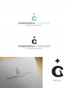
Design a charismatic and attractive Logo & Stationery for "Innergeeka Coaching - Developping Potentialities", a brand new Coaching-Consulting company
- Contest holder: fflavio
- Category: Logo & stationery
- Status: Ended
Start date: 15-06-2014
Ending date: 22-06-2014
It all started with an idea...
A short, interactive guide helped them discover their design style and clearly captured what they needed.
Brandsupply is a platform where creative professionals and businesses collaborate on unique projects and designs.
Clients looking for a new logo or brand identity describe what they need. Designers can then participate in the project via Brandsupply by submitting one or more designs. In the end, the client chooses the design they like best.
Costs vary depending on the type of project — from €169 for a business or project name to €539 for a complete website. The client decides how much they want to pay for the entire project.
This one is very nice. Good Job!
Please note the correct tag line is Developing Potentialities
No comments
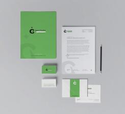
Hello, I've changed the design as asked, and apply the green and star you've picked. I hope you'll be satisfied. thanks again for your feedback
…but the green seems too dark in my opinion on a larger surface. we might need to change it again?
No comments
This light gree I like it more. Thanks. I'm considering which symbols is the best. Thanks again. nice job!
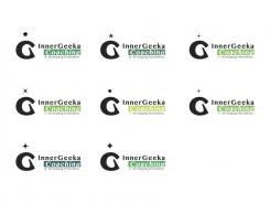
Hi, Here are some different propositions, let me know if one of them appeal to you. I'm working on the stationary so you can have a better look on the colors. sincerely
are you thinking of a lighter green or darker ?
looking at the options you provided. let's focus on the following only. Starting from the top left, moving to the right I like the 3rd first line.
And both of the 2 at the bottom line. the color, I like the lighter green you used for the 3rd at the first line.
Could you please make "Coaching" in green instead of having it inside the green stripe?
No comments
Very nice. BTW, the correct tag line is: Developing Potentialities"
Very nice. BTW, the correct tag line is: Developing Potentialities"
Hi clmbl3, can you elaborate a different green?
Could you also please provide some different symbols options to the star or work a little on its design?
thanks in advance
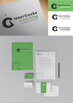
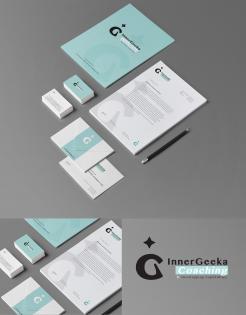
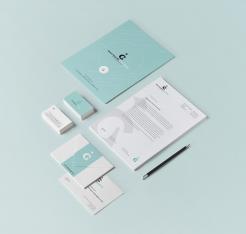
here is the stationary for the 2nd logo
thanks. what the oblique lines signify?
Ca you make the star a little smaller and provide an option in green instead of light blue?
the oblique lines are here to add movement, lifting up feeling… ( I made the green version without it )
I made the star smaller
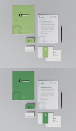
thanks for your feedback, here is an example of stationary
this is very nice. thanks. can you do the same with the other version of the same logo, the one with the logo on the left and the typo on the right of it?
No comments
very nice too.
thanks
very nice too.
thanks
Hello,
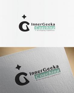
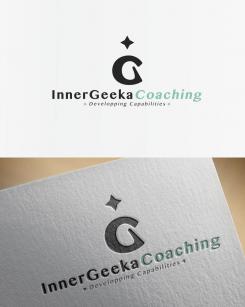
Here is my proposal for your logo.
the concept is a combinaison/mix of the letters I, G, C creating a silhouette reaching "the star" ( his full potential) from the inside " (inner strength)
I await your feedback and the stationary is coming soon.
Sincerely
Hi. Nice concept. Very interesting. Can you please work on the font and also on the positioning of the tag line? thanks
 Nederland
 België
 France
 Deutschland
 Österreich
 International
