hello
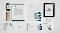
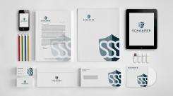
my other stationery and cards design, with reverse color. pls check.
pls feedback if there's anything improvement.
regards
philart
Design a logo, business card and corporate identity for a safety consultancy office.
- Contest holder: Schaaper Safety Services
- Category: Logo & stationery
- Status: Ended
- Files: File 1
Start date: 06-01-2018
Ending date: 20-01-2018
It all started with an idea...
A short, interactive guide helped them discover their design style and clearly captured what they needed.
Brandsupply is a platform where creative professionals and businesses collaborate on unique projects and designs.
Clients looking for a new logo or brand identity describe what they need. Designers can then participate in the project via Brandsupply by submitting one or more designs. In the end, the client chooses the design they like best.
Costs vary depending on the type of project — from €169 for a business or project name to €539 for a complete website. The client decides how much they want to pay for the entire project.
notice the card has qr code
Hi Philart, thanks for the adjustments, this is what I was looking for. Could you make the QR code for website: www.schaapersafetyservices.nl (last s was missing and .nl)? Thanks in advance, Jan
hello
YES i will do that. let me check. i will put the qr codes for that. thank you and more power.
best
philart
hello
gud day yes according to your suggestion i try to do a line on the letter at the bottom you can see the company address/tel.no. fax no. and websight
with the same colors similar to the logo.
pls. feedback if can i make improvement? let me know.
thank you
philart
hello
here's the stationery and cards sample. if there's anything question or improvement let me know. don't hesitate to message me.
thank you and more power.
regards
philart
Still like the logo design. I think the watermark on writing paper is a bit too dominant here. Perhaps something more subtle as watermark? Doesn't have to be the logo itself: a pattern/colour/decoration supplementary to the logo would be great.
Still like the logo design. I think the watermark on writing paper is a bit too dominant here. Perhaps something more subtle as watermark? Doesn't have to be the logo itself: a pattern/colour/decoration supplementary to the logo would be great.
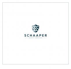
this logo has a shield for safety and protect. with SSS.
simple and clean logo design.
Thanks for the design. I like the style. Could you show how this looks like on business card and corportate identity (report cover)?
Thanks for the design. I like the style. Could you show how this looks like on business card and corportate identity (report cover)?
yes sure i will do that thanks for the rating. more appreciate
 Nederland
 België
 France
 Deutschland
 Österreich
 International


