No comments
Design a logo house style for an energy healing start up
- Contest holder: okki80
- Category: Logo & stationery
- Status: Ended
- Files: File 1
Start date: 03-07-2019
Ending date: 21-07-2019
It all started with an idea...
A short, interactive guide helped them discover their design style and clearly captured what they needed.
Brandsupply is a platform where creative professionals and businesses collaborate on unique projects and designs.
Clients looking for a new logo or brand identity describe what they need. Designers can then participate in the project via Brandsupply by submitting one or more designs. In the end, the client chooses the design they like best.
Costs vary depending on the type of project — from €169 for a business or project name to €539 for a complete website. The client decides how much they want to pay for the entire project.
I like this the best from the new options - maybe the new energy 'flower' (or whatever you call it;)) a little bit more to the background so the C/S thing is a bit more visible but we're getting there I think! The color green in the other options is too harsh - I prefer something similar to the violet, but then in green ;) (like ral 6011/6021).
Hi
I have made the changement. HOw do you think about the new version?
Best regards
Sariaka
No comments
Thank you for all the designs and elaborate work on business cards etc (Don't know if you're Dutch or English speaking??). I really like yours! I have 2 things I would like to see if that would be possible: 1 is the C/S part: I would like to be able to use that symbol separately as well and I don't know if it is completely clear in the form it is now. Is there any way to maybe make it a little bit more clear (like turn it a little or show the s a little bit more). Without ruining the logo of course! Other question was if you could show it in a color green. I like the more faded/chalc greens. I will add some examples:
https://www.ralkleuren.com/ral-classic/ral-6000-patinagroen
https://www.ralkleuren.com/ral-classic/ral-6011-resedagroen
https://www.ralkleuren.com/ral-classic/ral-6032-signaalgroen (maybe too bright).
Ok thank you:)!!
Hello
I have put the logo in green.
I also put the symbol above the logo to show which symbol goes with which logo.
Best regards
Sariaka
hi! Thanks for changes, good to see different options for the symbol. I'm still considering which one. Again to let you know I'm not just asking you to keep chaining things - I reallylike your design a lot and I just extended the competition a bit so we could work on it a little bit more (this is m y first time using this so I don't know how much we can do after the competition closes and I choose;)). Anyway - COLOR: I'm not really a big fan of the color green used - I would like it to be a bit brighter and closer to the colors I send as an example (https://www.ralkleuren.com/ral-classic/groentinten => I like 6000, 6026, 6028, 6032, 6036)
Another color that might be worth trying is more a violet kind (https://www.ralkleuren.com/ral-classic/ral-4003-heidepaars => 4001, 4007, 4011). DOn't know if this works for designs as well (RAL colors, but just to show you as example). And not sure yet if we should do it in 2 colors, but I will look at that as well - what do you think?
DESIGN: I don't know if that's meant to be, but I see also a silhouette of a person (head/shoulder/legs) on the car silhouette:), which I like! I was just wondering if it would be possible to give it somewhat of an energy vibe - like coming form either the silhouette or just the symbol (some 'radiation'/glowing you see sometimes in other healing logo's). Hope you kind of understand what I mean;)! Hope you can show me a few more examples with these changes! Thanks a lot, I really appreciate it! kind regards, Marjolein
Hello.
Thank you for your feedback.
I am working on it.
Best regards.
Sariaka
No comments
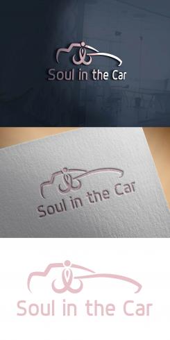
Dank je wel voor je inzending! Leuk zo met auto omlijning:). Het wordt in combi met het 'soul gedeelte' beetje druk misschien. Ik moet deze nog even laten bezinken...;)
No comments
Dank je wel voor je inzending! Wellicht dat het toch nog niet duidelijk was in omschrijving, maar ben eigenlijk op zoek naar een logo (plaatje met naam) en daarnaast een symbool waarin S en C verwerkt zijn (zoals in dit logo, wel heel leuk trouwens!). Dus dat zijn losse dingen van elkaar.
Hallo
U wilt dus een logo met SC erin of een logo en een SC afzonderlijk.
Vriendelijke groeten
Sariaka
Een logo dat meer de naam en wat ik doe weergeeft (in plaatje en met naam in woord) en daarnaast het symbool. groetjes Marjolein
 Nederland
 België
 France
 Deutschland
 Österreich
 International
