No comments
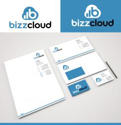
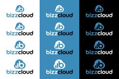
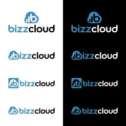
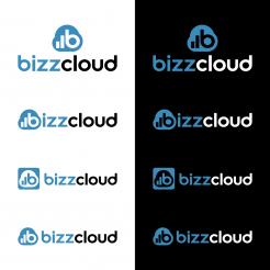
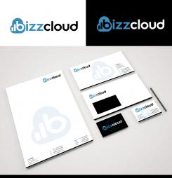
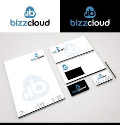
Design a new logo (and stationery) for a cloud business software company
- Contest holder: SwinkelsOnline
- Category: Logo & stationery
- Status: Ended
Start date: 22-04-2016
Ending date: 22-05-2016
It all started with an idea...
A short, interactive guide helped them discover their design style and clearly captured what they needed.
Brandsupply is a platform where creative professionals and businesses collaborate on unique projects and designs.
Clients looking for a new logo or brand identity describe what they need. Designers can then participate in the project via Brandsupply by submitting one or more designs. In the end, the client chooses the design they like best.
Costs vary depending on the type of project — from €169 for a business or project name to €539 for a complete website. The client decides how much they want to pay for the entire project.
Hi Hans,
attached the claoud size variations and a new idea for the layout of the housestyle. PPt I will send you via email,
kind regards, Dagmar
Good morning Hans,
once again, thank you for your feedback ;) Attached two versions with slightly wider clouds... Let me know, if you want it even wider, so I can adjust it in case.
Have a nice day, kind regards, Dagmar
Hi, this one looks very nice. Can you create a couple of options with the logo perhaps 10, 20 and 30 pixels wider? Because it is narrowed now the cloud does noet look as strongly as a cloud as it did before. We really do like the basis though.
And do you also have any further ideas on the stationery as well? And can you deliver a standard ppt template?
Hope to hear from you soon!
Hans, team BizzCloud
Good morning Hans,
I will show you the different sizes for the cloud soon, as well as more variations for the stationery.
For the PPT template ideas it would be good if you could send me your email adress to info@virtual-lies, because I think this way its easier to send it to you than to load up a zip file via brandsupply.
Have a nice day, until soon, Dagmar
Hi Dagmar, you can reach me on hans@bizzcloud.nl. Thanks in advance and good luck!
You also have a nice day ;-)
Hans
Good morning Hans,
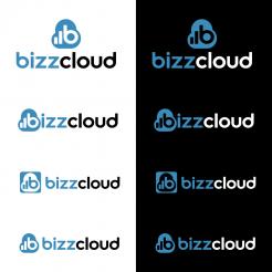
thank you for your kind feedback ;) Attached 4 different versions to combine the image sign and headline, regarding the changes you requested. For two of them I also designed a first layout of an according housestyle, if you should have any ideas or wishes to improve these, please just let me know. Maybe you prefer another background color (blue) or font style for it?
Hope you like it, kind regards, Dagmar
Hi Dagmar,
We like most of the corrections so far. Although the new cloud actually has the same height as width, it looks a little bit too high. In addition, the cloud part on the left and right of the bars and the 'b' are very narrow. Can you work a little bit further on the cloud and maybe widen it a little bit?
KR Hans, team BizzCloud
hello KR Team BizzCloud,
thank you very much for your kind feedback and the positive rating of my first proposal ;) Attached a revision with the requested changes you sent me. Please let me know, if this is the way you wanted it, or if there are more corrections to be made.
Kind regards, Dagmar Lange
Hi Dagmar,
Thank you for your updates. We really like the logo design so far. Can you arrange for us the following minor adjustments:
- Can you make the cloud image a little narrower? The width vs height is now approx. 4 x 3. We would like to see it 1 x 1. I think it helps when you move the bars and the 'b'a little bit to the left and use less cloud on the right of the 'b' in the logo. If you wonder why we want this: we would like to use the cloud for instance as a favicon.
- Can you then make the cloud a little smaller in comparison with the text 'bizzcloud'? Maybe like 80% of the size it is now?
- Can you make a variation in which u use the same 'b' in the cloud logo as you use in the text 'bizzcloud'? I understand the bars then probably will have to be narrower too and maybe that looks like nothing. We're just curious. Again, if you wonder why: this allows us to use the cloud logo in front of the 'bizzcloud' text.
- And lastly, what kind/type of font(s) do you suggest we use for our stationery?
We are really looking forward to your next designs!
Kindest regards,
Hans Swinkels
BizzCloud Team
No comments
Hi, we like the basis of your logo design. Could you come up with these adjustments:
- We like the font for bizzcloud, but the letter 'u' looks very wide. Could you make it just a little bit smaller?
- We love the thing you did with the increasing bars in the logo. Can you end with the letter 'b' so leave out the 'c'? Pls make the 'b' in the size of the current 'c' in that cloud. I will try and send you a draft. You should then have a logo that is more symmetrical.
- Please leave out the gray bar between the cloud and the logo text
- Please remove the tagline 'CLOUD BUSINESS SOFTWARE'
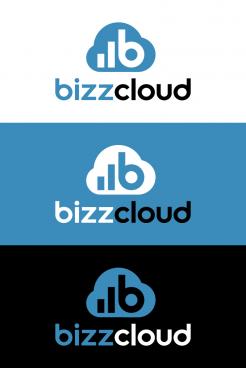
- Pls also make a version with a blue background and white and/or black filling.
- Can you use RGB color 59-140-187?
We are looking forward to seeing more of your work! Pls contact me if you have any questions.
KR Team BizzCloud
 Nederland
 België
 France
 Deutschland
 Österreich
 International
