No comments
Haendel logo and identity
- Contest holder: lperez
- Category: Logo & stationery
- Status: Ended
Start date: 19-11-2021
Ending date: 06-01-2022
It all started with an idea...
A short, interactive guide helped them discover their design style and clearly captured what they needed.
Brandsupply is a platform where creative professionals and businesses collaborate on unique projects and designs.
Clients looking for a new logo or brand identity describe what they need. Designers can then participate in the project via Brandsupply by submitting one or more designs. In the end, the client chooses the design they like best.
Costs vary depending on the type of project — from €169 for a business or project name to €539 for a complete website. The client decides how much they want to pay for the entire project.
thank you. Up to now you are among the best. Classy, inspires growth and order at the same time
hello sir
thank you for your feedback
please contact me if you submit changes
nice to work with you
regards.
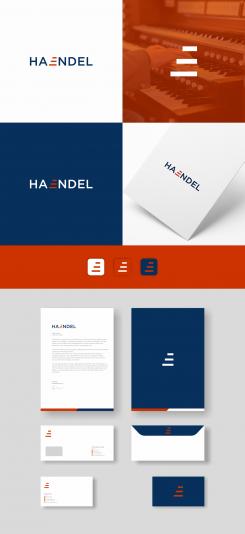
the logo with the letter E which became the icon represents the growth and order of a classy and neat musical tone)
indeed
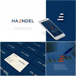
this is very nice. We are about to finalize and you are among our top three choices. Could you give us a bit more example of how we could use this for visual identity (on business cards, letter head, etc). We are thinking of using only the three red marks on page 2 or on top of business card or other. Any suggestion ?
hello sir
thanks, really happy for your feedback today
yes, of course i will do my best as you ask
Please wait a moment
Greetings.
No comments
hello sir
how about this?
please your feedback.
No comments
the previous one was better. Because the E is what is special about this name. And because the three bars stacked on top of each other can be put on page 2 without the whole name. I need to think how this could look on business cards, stationnary and website
 Nederland
 België
 France
 Deutschland
 Österreich
 International
