No comments
Help me inspire dutch people to live healthier
- Contest holder: Purpose Life
- Category: Logo & stationery
- Status: Ended
- Files: File 1
Start date: 11-01-2017
Ending date: 25-01-2017
It all started with an idea...
A short, interactive guide helped them discover their design style and clearly captured what they needed.
Brandsupply is a platform where creative professionals and businesses collaborate on unique projects and designs.
Clients looking for a new logo or brand identity describe what they need. Designers can then participate in the project via Brandsupply by submitting one or more designs. In the end, the client chooses the design they like best.
Costs vary depending on the type of project — from €169 for a business or project name to €539 for a complete website. The client decides how much they want to pay for the entire project.
No comments
This is Great!
Thanks!
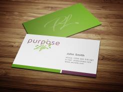
The favourite logo for now is one below, I gave it 5 stars. I hear it has a great balance and is best to read.
No comments
I like the purple background, could you make the logo in white or very light purple as you did for the green?
With logo I mean the P.
And could you try some other combinations of P and leaves? Maybe with a whole branch?
Glad you like my work. Slogan and everything can be changed at any time and even later when the contest is over if they need some changes and corrections
Good to know, thank you!
No comments
Thank you, I like your work. I am busy asking some friends about which logo they like best.
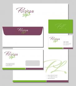
For the housestyle, I am not yet convinced about the PL on the back, maybe you could try to combine the P and the leaves of the L?
Also, I prefer the purple above the green for the background of the card.
I am still doubting about the slogan (preventief vitaal).
If I choose you, would it be eventually possible to change the slogan after tomorrow (the end of the contest) once I have found a good one?
No comments
For now, this is the favourite logo of my friends.
Could you for now remove the slogan? This slogan was made up by a designer and I don't really like it.
No comments
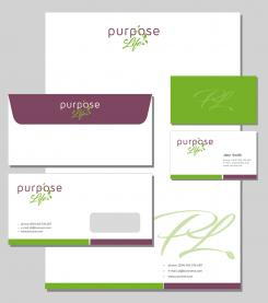
Could you propose me a few housestyles with this logo? One using the p and another one with the o and the leaves going through it?
No comments
I like the idea of making the P start a little lower than urpose.
Thank you for your comments. For letter P I used an existing font with small modifications. This is a design with thinner letters
Thank you, I prefer the thinner letters.
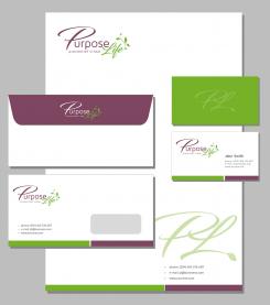
I also like your idea of starting the L with a leave too (your last concept). At the same time, the L underlining the e is also nice.
Instead of using the leaves on the background of the homestyle, I would like to use letters. The P, or maybe the P and the L. Since I would like it to illustrate the idea of a goal more than life and leaves.
In this sence I was wondering if you would have an idea of how to give even more a dynamic idea of goal to the P.
 Nederland
 België
 France
 Deutschland
 Österreich
 International
