Hello,
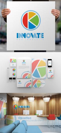
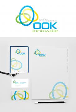
I'm happy to present you the full version of the OOK Inovatie branding identity style.
I hope you enjoy it.
I want to stand out in diversity
- Contest holder: OOK Innovatie
- Category: Logo & stationery
- Status: Ended
Start date: 19-08-2014
Ending date: 02-09-2014
It all started with an idea...
A short, interactive guide helped them discover their design style and clearly captured what they needed.
Brandsupply is a platform where creative professionals and businesses collaborate on unique projects and designs.
Clients looking for a new logo or brand identity describe what they need. Designers can then participate in the project via Brandsupply by submitting one or more designs. In the end, the client chooses the design they like best.
Costs vary depending on the type of project — from €169 for a business or project name to €539 for a complete website. The client decides how much they want to pay for the entire project.
Thank you for all the different styles. You have a very interesting design.
My pleasure) I'm happy you like it.
I tried to do my best to keep the idea we had and make the logo original and stylish.
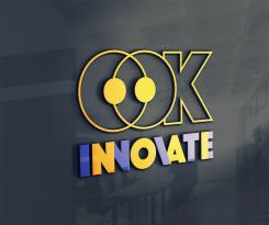
As an alternative - a version for business cards to stand out)
http://seeklogo.com/2ok-logo-607.html
bijna dezelfde logo
http://img.artlebedev.com/everything/kaluga/ok.gif
Maybe practically solved but not original.
One can spend time and find something similar in the world. The funny thing is that it is a logo of some Ukrainian designer. I live in Ukraine too but I have never seen this logo before. As I can understand there is a symbolic man in the logo in form of Okey. I tried to find out smth about the brand - it doesn't exist as far as I can see. I made the logotype specially for OOK Innovatie.
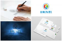
that's my drafts and the process of creating the logo
https://www.dropbox.com/s/mm3tlv25rb2fhlw/ook.jpg?dl=0
ok thank you. no worries
No comments
Heel aardig alternatief van je andere ontwerp. Leuk!
Sorry english now. Very nice alternative design
Dankjewel)
I tried to understand more what you're looking for.
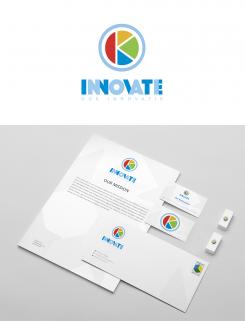
Introducing you the new design.
Hope you enjoy it!
The logotype in circle consists of two letters "O" and "K" inside of them forming "OOK".
This is a very intriguing design. Thank you. Really different from the others.
No comments
Ik vind deze kleuren beter dan de blauw, geel en rood in het andere ontwerp van je
Hallo!
Ik spreek een klein bijtje Nederlands. Ik hoop ik heb u goed begrijpen)
yes, you have understood me perfectly. Thank you
 Nederland
 België
 France
 Deutschland
 Österreich
 International
