Good evening Marcel,
hope I got everything together, according to your last feedback ;)
Have a nice weekend & kind regards, Dagmar
Logo and corporate identity for a purpose oriented startup that focuses on organizational development
- Contest holder: YourPurpose
- Category: Logo & stationery
- Status: Ended
- Files: File 1, File 2, File 3
Start date: 30-09-2017
Ending date: 07-10-2017
It all started with an idea...
A short, interactive guide helped them discover their design style and clearly captured what they needed.
Brandsupply is a platform where creative professionals and businesses collaborate on unique projects and designs.
Clients looking for a new logo or brand identity describe what they need. Designers can then participate in the project via Brandsupply by submitting one or more designs. In the end, the client chooses the design they like best.
Costs vary depending on the type of project — from €169 for a business or project name to €539 for a complete website. The client decides how much they want to pay for the entire project.
Like this?
Kind regards, Dagmar
5 stars! I will show this design to my business partner tomorrow and let you know. Many thanks.
You're welcome & thank you for the stars ;)
Hi Dagmar. End of the day will be the closing of the contest and as you know, we really like your design. Could you do us a favor by showing us a few more possibilities. First: a change of the tagline (again .... ;-) ) Could you put there " Your Values . Boosted . Shared. " Second: after all, we like the font you used in the first design best. So let's go back to that one. Third: We really like the green color (Is it lemon-green?), but would also like to see the design in a combination of the colors blue and grey (and white). So change the green color for blue, e.g. the blue color that is used in the Facebook logo. Hope I am not bothering you too much ...... Thanks again
Don't worry that I might be bothered ;)) Will show you the revision this evening, because I dont have the time before to do it. In case that there's something else to change and you want to choose my design, there's still time to do that after the contest has ended ;)
Kind regards, Dagmar
Sorry, but I dont find the link for the facebook page? Could you send it to me?
Hi Dagmar. Sorry that my explanation was not clear enough. I did not mean to redirect you to my Facebook page. What I meant is, that I would like to see the logo and house style in the blue color that is used in the Facebook logo (or in a similar color that suits, I leave that up to you). As you have probably understood I really like your design. The final choice will be made by me, together with my business partner in the beginning of next week, so don't worry about the timing of your revisions. If you can do them in the course of this weekend, it is fine! Best regards, Marcel
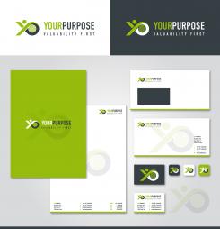
Housestyle with image sign on the left side ;),
kind regards, Dagmar
It becomes better and better Dagmar! I think I prefer this font above the other one. What do you think? And I have a few more ideas and hope you can show them. First: as we are still doubting about the right tagline, could you please put "Build values from a vision" as the tagline. Second: I am curious how the logo would look like, when you put a solid green circle in the place of the planet earth image. Is it possible to show these changes?
No comments
I like the font. Difficult to choose between the two different fonts you used. Regarding the figure, I still think that the first one you sent yesterday looks the most powerful. And I think I prefer the positioning where the figure is placed at the left side of the text.
Same idea, different style...
Same comment as above.
First housestyle design with a different visualization for the planet earth ;)
Kind regards, Dagmar
I like your design very much. Would the text "step up to valuability" fit as the tagline?
Thank you for the rating ;) Attached an alternative combination, I will show you a first layout for the housestyle and an alternative for the earth part shortly,
best regards, Dagmar
Good morning,
attached a new idea for the image sign,
kind regards, Dagmar
Nice! I can see people and planet in it and the logo shows progress and movement. Would you have alternatives to show the planet part? And could you show how this logo would look on stationery?
Maybe this color combination is better ;)
Kind regards, Dagmar
Definitely better. Thanks
Good morning,
thank you for your feedback and rating. Attached a first revision in color including an idea for a slogan ( with a twinkle ;) ),
kind regards, Dagmar | VirtualLies
I like the tagline! The whole picture is a bit too colorful now, but certainly the whole design has been improved.
 Nederland
 België
 France
 Deutschland
 Österreich
 International
