No comments
Logo and housestyle for a start-up consultancy - Ethics at Work
- Contest holder: bartamsterdam
- Category: Logo & stationery
- Status: Ended
Start date: 26-02-2012
Ending date: 07-03-2012
It all started with an idea...
A short, interactive guide helped them discover their design style and clearly captured what they needed.
Brandsupply is a platform where creative professionals and businesses collaborate on unique projects and designs.
Clients looking for a new logo or brand identity describe what they need. Designers can then participate in the project via Brandsupply by submitting one or more designs. In the end, the client chooses the design they like best.
Costs vary depending on the type of project — from €169 for a business or project name to €539 for a complete website. The client decides how much they want to pay for the entire project.
Thank you, this looks good. Can you also come up with a digital letter template and a template for invoices?
Thank you for the fast responses. The Font i used is Helvitica Light. I will make the invoice and digital letter template tonight.
Best wishes,
Sander
No comments
Thanks.
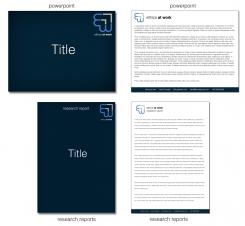
1. For the Powerpoint template, I would like to put the title of the presentation in the middle of the first page. Could you move the logo and name to one of the corners?
2. For the Word template, I also would like the title and author in the middle. Therefore, the logo would have to move.
What font did you use? Helvetica or Arial?
Best wishes,
Bart
No comments
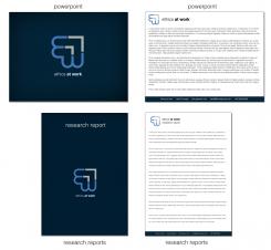
Thank you. I think the logo on second pages is a bit too similar to the Dutch Rijkslogo. Could you use the blue and grey one on a white background? I believe that might look better. Could you also fill the docs with a text in the typeface you propose?
No comments
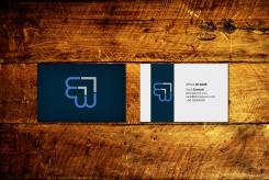
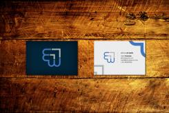
business card example
Tomorrow i will make the templates.
Sander
I really like what you have done to the back of the business card! Dark blue with the logo. The front is a bit busy - I'd maybe lose the grey in the bottom LH corner and I'm not sure about maybe even getting rid of the blue in the top RH corner.
I don't have a strong opinion about the different blue / grey options as they're quite similar and would have to see them on the template versions.
Looking good so far!
No comments
Thanks for the quick response!
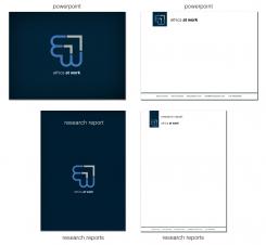
Is this more what you imagine?
Sander
No comments
I quite like these. Thank you, Sander.
Can you also come up with letter and invoice templates, a template for research reports, a Powerpoint template and a design for a business card?
No comments
Dubble click on the picture for the correct quality.
Sander
Dear Sander,
Thank you for your work.
The 2nd of the three doesn't work for me at all (looks like a growth hanging off the end of the name). But the first and third have some potential. What about the first logo but with the words below and bigger (like the third option) but with different colors, like blue and grey?
 Nederland
 België
 France
 Deutschland
 Österreich
 International
