No comments
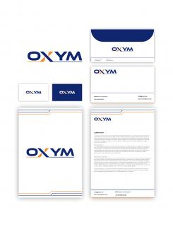
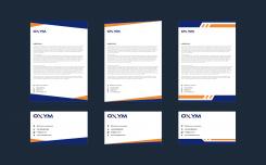
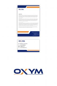
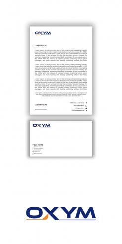
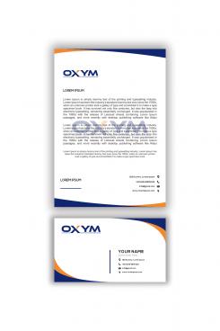
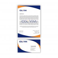
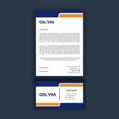
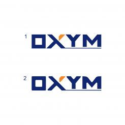
logo and identity for an industrial machine wholesaler
- Contest holder: fortex
- Category: Logo & stationery
- Status: Ended
Start date: 13-01-2021
Ending date: 20-01-2021
It all started with an idea...
A short, interactive guide helped them discover their design style and clearly captured what they needed.
Brandsupply is a platform where creative professionals and businesses collaborate on unique projects and designs.
Clients looking for a new logo or brand identity describe what they need. Designers can then participate in the project via Brandsupply by submitting one or more designs. In the end, the client chooses the design they like best.
Costs vary depending on the type of project — from €169 for a business or project name to €539 for a complete website. The client decides how much they want to pay for the entire project.
No comments
it's not exactly what i m looking at
but i will choose you as winner an then maque ajustment my self
hi sir,
I am very grateful, can you give a star
thank you sir
greetings refky00
No comments
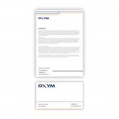
now that you have remove icons try to ajust the positions of the address
you can even manage the lines as on business cards
No comments
this is better
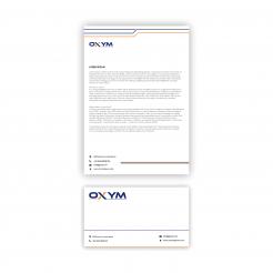
why do you always use icons instead of simple text for phone numbre, address, email and website ?
this could change the head paper appearance
No comments
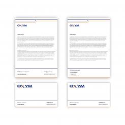
could you make a head paper with lines instead of bands
hi sir
I've changed it back, please check this one
thank you.
the logo is ok
but head paper is not good
hi sir
I have changed it,
Please check this one
thank you sir.
it's ok for the left leg but please keep the upside of the "x" like it was before
i still don't love the business card and the head paper
may be you can proposed some thing else
i still don't love the business card and the head paper
may be you can proposed some thing else
hi
please check this one,thank.
please try to proposed some thing original
you have just remove bands that is good but not enough
futher more please also make some modification on the "x"
put the left leg of the "x" in orange
hi sir,
I have changed it, and I have changed it to be thinner, I made it like this because you are an industrial company,
thank you sir,
greetings refky00
please could you proposed a head paper without these bands
hi sir,
please check this one , thank.
why do you absolutly want to put those bands for me they are too bulky
please proposed someting thinner
hi sir
please check this one , thank.
I don't like it
the bands are too coarse
hi
please check this one , thank.
i doesn't like
let's try with round characters
hi
please check this one,thank.
i really love it
but letters are not harmonize
may be you can make 2 propositions
one with rounded characters with unrounded characters
please also make proposition for business cards
and head paper
for the round characters you can keep this "O" i really love it
 Nederland
 België
 France
 Deutschland
 Österreich
 International
