No comments
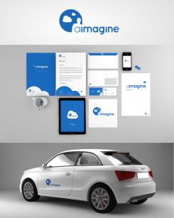
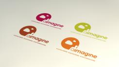
Logo/ CI for a coaching company
- Contest holder: HMO1978
- Category: Logo & stationery
- Status: Ended
Start date: 04-06-2013
Ending date: 04-07-2013
It all started with an idea...
A short, interactive guide helped them discover their design style and clearly captured what they needed.
Brandsupply is a platform where creative professionals and businesses collaborate on unique projects and designs.
Clients looking for a new logo or brand identity describe what they need. Designers can then participate in the project via Brandsupply by submitting one or more designs. In the end, the client chooses the design they like best.
Costs vary depending on the type of project — from €169 for a business or project name to €539 for a complete website. The client decides how much they want to pay for the entire project.
Hi Heike,
here are some changes, with an alternative subtitle just to give you an impression.
Greetings Chris
Good morning Chris - WONDERFUL! I was thinking about your comments and I even think that it can go without any further subtitles - just letting the logo and the name speak. I like very much the merge of the logo with the name (thus the left option)!
Thanks very much - looks really great,
Heike
Dear Heike, thank you for the constructive feedback :). But why do you have to digest it, i think it isnt´t that bad ;)
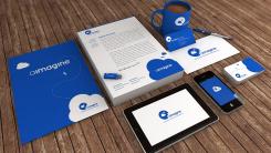
Sooo here is another version of the CI with a strong and guiding blue. Just added and changed few things.
Please be gentle by rating the positioning and so on it isnt´t final yet. Just for previewing you the overall concept.
So hope you like it. If you want to see another color look out for any color code, like (#1051BD), in this composition and give it so me, so i change it again.
Ty Chris
Ps. Meanwhile, the coffee is cold , sorry for that :D
Hi Ty,
Wonderful - not only the new color scheme but also your quick response!
Really like it - has something of the sky but with much more intensity!!!
Well done.
Enjoy the evening,
Heike
Ty i´ll upload a detailed version in the next days.
Good Time
Chris
Hi Chris,
Just looking over the proposal with a good friend - we really like it. As a question to you: can we increase the focus of the human a bit? Still with clouds etc but that also on the large poster the human is still recognizable?
What do you think?
Thanks in advance,
Heike
Hi Heike,
ty for the praise. I guess there are two possibilities the get more focus on the humnan-factor. One: to Center the Human, but then we have to get a new position for the name "aimagne". Second: To resize some elements.
But I don´t think that we get in trouble perceiving the elements on large scale :) But of course we can play around with it.
During the design process i often get in trouble by positioning the subtitle of the logo (self-recognition - self-determination - self-realisation). My advice from the "Designers" point of view you should shorten it and get the essence in one short statement, like "reconsider you" "reconsider yourself" "rethink yourself" or something like that. Just guessing :)
What do you think?
Greetings Chris ;)
Hello, just to get an idea of the CI.
It isn´t finished yet, but some feedback would help me to get closer to what you a"imageine" :)
Hope you like it so far.
Ty
Hi Ty,
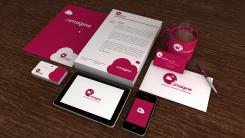
I like the design at lot - a nice way in displaying what the the purpose of the coaching is! Well done! I'm just not as sure re the colour - could you play a bit with this?
Thanks a lot in advance,
Heike
Sorry, as another thought/ input: i had a look on the previous colour codes - I prefer rather strong colours (because of readibility) but am not sure whether the magenta is a bit too aggressive?! as said, I'm still digesting :-)
Bildersprache mit viel Wert auf Typografie.
Feedback gewünscht :)
Wonderful - very imaginative and not only pointing out to the obvious but also the state where the coachee/ the client should end up to - a world where he/ she can dream and live his/ her life.
Well done!
As an idee: Could we get this end state even clearer?! ;-)
Oh ty very much, that is what i hoped for :)
So the idea is understood :)
Of course we can work on the final CI as you wish. Just tell me what color do you prefer..so I can go for it.
bye
 Nederland
 België
 France
 Deutschland
 Österreich
 International
