design 13
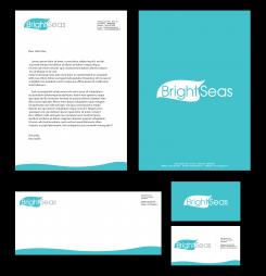
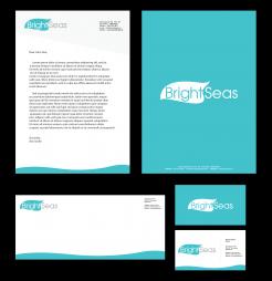
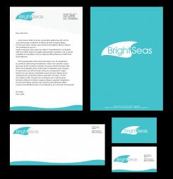
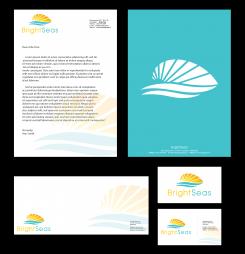
Logo corporate identity for my new started company Brightseas
- Contest holder: mhopmans
- Category: Logo & stationery
- Status: Ended
Start date: 12-07-2020
Ending date: 19-07-2020
It all started with an idea...
A short, interactive guide helped them discover their design style and clearly captured what they needed.
Brandsupply is a platform where creative professionals and businesses collaborate on unique projects and designs.
Clients looking for a new logo or brand identity describe what they need. Designers can then participate in the project via Brandsupply by submitting one or more designs. In the end, the client chooses the design they like best.
Costs vary depending on the type of project — from €169 for a business or project name to €539 for a complete website. The client decides how much they want to pay for the entire project.
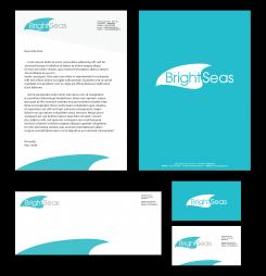
really nice! I see the light grey part on the top of the letter in design 12 is missing. Furthermore I would like to see a name and role on the business card format. Many thanks
really nice! I see the light grey part on the top of the letter in design 12 is missing. Furthermore I would like to see a name and role on the business card format. Many thanks
Hello,
i removed the grey part coz pure white color will give nice contrast to logo color.
design 04
Ik vind dit een mooi en strak design en fraaie kleurstelling, dank hiervoor! De golf is alleen wel wat zwaar/hefit. Voor mij zou de golf beweging moeten symboliseren (ik ben in staat om zaken in beweging te krijgen). Nu kan het ook overkomen alsof het een vloedgolf is (of zoals mijn zus zei: een haai of rog). Kun je daar wat mee?
sorry, probably need to do this in English ;-). I really like your design, thank you for that! The only thing that I am doubting about is that the wave is a bit heavy: for me it needs to symbolize that I can put thing in motion / create a movement. Now it might come across like a tidal wave (or a shark or stingray as my sister mentioned). Could you make that a little bit more subtile?
I also really like this colour by the way, so I hope you have time to look at my feedback above. Thank you!
 Nederland
 België
 France
 Deutschland
 Österreich
 International
