No comments
Logo design for Coach Marijn
- Contest holder: Marijn11
- Category: Logo & stationery
- Status: Ended
- Files: File 1
Start date: 16-09-2019
Ending date: 06-10-2019
It all started with an idea...
A short, interactive guide helped them discover their design style and clearly captured what they needed.
Brandsupply is a platform where creative professionals and businesses collaborate on unique projects and designs.
Clients looking for a new logo or brand identity describe what they need. Designers can then participate in the project via Brandsupply by submitting one or more designs. In the end, the client chooses the design they like best.
Costs vary depending on the type of project — from €169 for a business or project name to €539 for a complete website. The client decides how much they want to pay for the entire project.
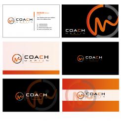
Ok. The last one is the best. Can you do the compilation of the 6 with that one? And 'training & begeleiding' in the middle?
reached the limit of 15 submissions.can can you remove stars non comment submitions.. i have no chance for add my revision file.
Hmm doesn't work... Maybe with email? It's info@coachmarijn.nl
check please
No comments
Really nice! Thank you. Curious if someone can beat you.
Ok. I think you will be my winner. I really like al these creations. I only think if you look close to the logo you can see a person who is bend... And some will see that like s*x. So maybe you can change the head?
And also the resolution of the logo looks a little low. Can you make it a bit sharper?
Thanks, you are truly awesome! :)
No comments
Nice! Maybe I will change the 'training en begeleiding'. You can put it in the middle. You are number 1 right now. How does this look on a card?
No comments
Can you do it like your C in Coach?
No comments
Nice colors. Can you make it in 3D style like QumaraArt did?
Like your C :). But than in your logo
No comments
I would not change the Coach Marijn.
this is early submit . i made your request.
No comments
Like it. Maybe the gray a bit darker. The A just the A. Only 'training en begeleiding'.
And can you watch the first design of QumaraArt. How he did the C. It looks 3d. Can you do that?
No comments
?
Need Comment for go ahead.
I like this one the most from your logo's! I also like the one from qumaraArt. Can you use this logo with the style he used his logo. The orange a bit thicker and that shades. And also the way he used Coach Marijn, with Marijn a bit smaller and spread. Hope you understand. Thanks!
No comments
Can you some comment for me.
I like your creativity. Maybe you can see my comment at qumaraArt. I like his shades and font style.
Thanks your comment. I will try do something. Thanks. Nice Day.
 Nederland
 België
 France
 Deutschland
 Österreich
 International
