No comments
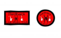
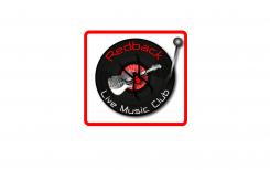
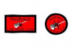
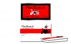
Logo for a live music club in Cologne (Redback Live Music Club)
- Contest holder: Redback
- Category: Logo & stationery
- Status: Ended
- Files: File 1, File 2
Start date: 09-09-2013
Ending date: 30-09-2013
It all started with an idea...
A short, interactive guide helped them discover their design style and clearly captured what they needed.
Brandsupply is a platform where creative professionals and businesses collaborate on unique projects and designs.
Clients looking for a new logo or brand identity describe what they need. Designers can then participate in the project via Brandsupply by submitting one or more designs. In the end, the client chooses the design they like best.
Costs vary depending on the type of project — from €169 for a business or project name to €539 for a complete website. The client decides how much they want to pay for the entire project.
Hello Andy,
I have them rotated 17 degrees
and made them a little smaller
with regards Petje
Great! Thanks :-)
Hi Andy,
Thanks :-)
regards Petje
No comments
I still prefer the "old stlye" spider.
Hi And yes i prefer the other also ,but i always try something :-)
with regards Petje
No comments
Again thank you! I hope I don't go on your nerves already but I think it would be better to turn the instruments a little bit and to make them a little bit smaller (especially on the round logo). I would turn the sax anti-clockwise a little bit and the guitar clockwise. What do you think? With regards, Andy
Hello Andy,
Thanks and gonna make the changes
i think that's much better (thanks for the feedback) i send them ok
with regards Petje
No comments
Hello Andy,
Something like this
with regards Petje
Hi Petje, thanks again for your fast reply! To me it looks a little bit too unsteady. What do you think of having just two little plain white instruments (like e.g. guitar and saxophone) left and right side of the spider?
hello Andy,
gonna make it for you i send it when its ready
with regards Petje
No comments
Wow!! Again very good. You can read thoughts... :-)
Hello Andy,
Thanks again! :-)
Have a great weekend!
With regards Petje
Hi Petje! The others catched up. Especially the designs of loop and blocpuzz I also like very much. Their designs are more classical (based on a record) your is more modern. It will be very hard to decide. One thought I had: What do you think of reducing your logo a little bit? Maybe displaying just a single instrument with the spider (like a guitar for example) instead of a complete band?
Hello Andy,
i gonna change it for you !
with regards Petje
No comments
Perfect! The others will have a hard job to beat you!
Competition ends on 30/09/2013.
I will let you know about the result.
Thanks again, very good job!!!!
Andy
Hello Andy,
Thanks for the compliment, and if you still want something changed.
Please let me know !!
With regards Petje
Hi Petje! Still one of my favorites but the others are heading up... Could you please make a proposal for an additional horizontal design/writing in the same style for illuminated advertising outside the building ("Lichtreklame", "Außenbeleuchtung"), business cards etc.? That would be great!
Hello Andy,
thanks again Andy
I made it already yesterday i send it !!
With regards Petje
No comments
Hi Petje,
thanks for your design proposal! It looks very nice! Especially the spider and the font, but the clef is too dominant in my view.
Would you mind to adjust it a little bit, so that the clef is not so dominant or change it to an instrument or a music note ("Note" in German)?
Thanks, Andy
Hello Andy,
I gonna change it and send the new one !
Regards Petje
 Nederland
 België
 France
 Deutschland
 Österreich
 International


