Greetings,
I hope this new adjustments are hopefully what you are looking for, if you have a different preference for the font you could give me a suggestion, but I personally think the serif style fits the best for the atmosphere
Mourning in practice is looking for a warm comforting but also positive logo corporate identity
- Contest holder: deesengene
- Category: Logo & stationery
- Status: Ended
Start date: 20-05-2020
Ending date: 29-05-2020
It all started with an idea...
A short, interactive guide helped them discover their design style and clearly captured what they needed.
Brandsupply is a platform where creative professionals and businesses collaborate on unique projects and designs.
Clients looking for a new logo or brand identity describe what they need. Designers can then participate in the project via Brandsupply by submitting one or more designs. In the end, the client chooses the design they like best.
Costs vary depending on the type of project — from €169 for a business or project name to €539 for a complete website. The client decides how much they want to pay for the entire project.
I love it!!
This is a new version, hope this one suits you as well
Hello~ here is a few other branch variation, hope you like these, I could change up some stuff again if needed
I needed to clean some lines a little bit in these, due to time, but I will after feedback :)
Greetings,
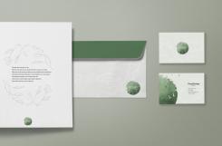
I am glad to hear you enjoyed my design, here I made some adjustments to the logo and applied them on some stationery mockups ass requested, hope you enjoy it :)
If something is not right don't hesitate to let me know so i can change it :)
Greetings,
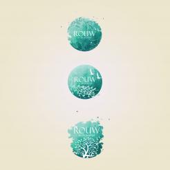
Here are my versions for your logo, if there is a favorite or something you like from it please don't hesitate to let me know.
Wow, I'm pleasantly surprised! The top one is my favorite. I would love to see what this logo looks like with the following suggestions:
* can you make the words 'in practice' a bit bigger?
* I find the birds of the bottom logo just a bit nicer in size and placement. Can you adjust this?
* I would also like to see what it is like when the lines of those bottom leaves and twigs at the bottom are white.
Can you make this logo a proposal for business card, letterhead, compliment card and so on? Thank you, i'm very curios! Greetings, Desiree
I mean the words: in de praktijk.
 Nederland
 België
 France
 Deutschland
 Österreich
 International
