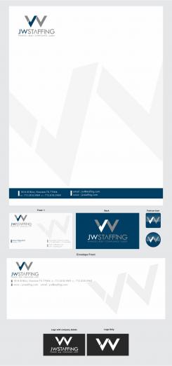
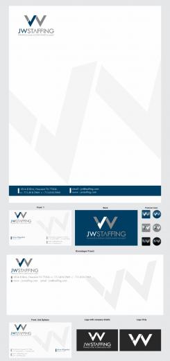
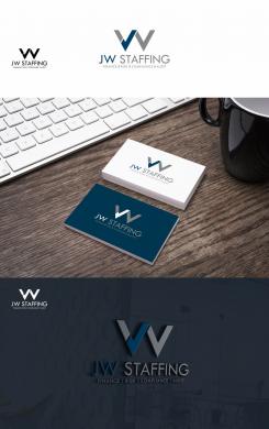
Hope this is final corrections as per your said ... see the private message too
Starting company in recruitment business
- Contest holder: johanwilgenhof
- Category: Logo & stationery
- Status: Ended
Start date: 29-08-2017
Ending date: 05-09-2017
It all started with an idea...
A short, interactive guide helped them discover their design style and clearly captured what they needed.
Brandsupply is a platform where creative professionals and businesses collaborate on unique projects and designs.
Clients looking for a new logo or brand identity describe what they need. Designers can then participate in the project via Brandsupply by submitting one or more designs. In the end, the client chooses the design they like best.
Costs vary depending on the type of project — from €169 for a business or project name to €539 for a complete website. The client decides how much they want to pay for the entire project.
Oke thank you, for the size on the envelope of the logo and adress, I assume it is adjustable when I want to have it printed? Because it is a little too big now for putting the addressee in the center.
Hope i have submitted all the things as per your feedback ... if anything missing or need any more changes please feel free to made it done ... morover i have given 2nd option of Business card, as i saw you love in left alignement in the Letter head so i made another B Card to make it family stationery all in left side and your name in right... i have done 3 different options for favicon icon in square and circle too and logo in white with company details and Only Logo too ... which one to be done in final do tell me clearly
Regards
whitecat
I think you're doing a great job whitecat! My remarks on your last adjustments:
- the vertical lines in the business card, the writing paper and envelope a liitle bit thinner so they look more subtle to me.
- the favicon in blue is my favorite.
- the left aligned Business card with my name in the left is my favorite.
- When you send me the originals is it possible for me to change adress, phonenumber, etc?
- and last question when I want to change the subtitle in the logo (Finance, Risk,etc) is this possible of should I contact you for this?
You see, I am a layperson in this matters :))
Thanks Johan
Thanks for your helping hands ... do give the feedback sir
Thanks whitecat, it looks very nice to me. I have a few remarks:
On the envelope:
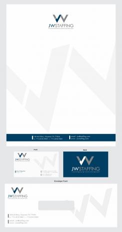
-In the left top corner the logo and immediately beneath that, the adress in one line. Maximum space to be used from the top is 40 millimeter (Dutch posting demands).
On the writing-paper:
-could you outline all to the left, and maybe the logo a little bit higher and/or smaller.
- Could you make a separate flavicon?
- Can you make a logo just in white for the use on black backgrounds.
Thanks!
And could you look to the vertical lines between te the words. I would like to have them a little more subtle, to say thinner :)
Thanks for your good scoring and feedback .... here it is as per your direction to " JWStaffing " ... looking forward to your feedback ... please be aware of copy and making little modifications destroying the charm and beauty of originals ...
Thanks whitecat, I noticed....Your logo looks just perfect and matches my qualifications.
In addition could you please show me the complete housstyle.
Goodmorning,
Here is my work for your new visual identity. You can see the files in good quality by clicking on the images.
I bring my experience in graphic design to create a powerful and distinctive logo. I hope you will enjoy my work as much as I enjoyed working on your project.
I await your feedback and I remain at your disposal.
Best regards
whitecat
Thanks for your submission whitecat. It looks very nice and suits my expectations at a high level. Could you please put the words JWStaffing together?
Thanks for your submission whitecat. It looks very nice and suits my expectations at a high level. Could you please put the words JWStaffing together?
Thanks for your submission whitecat. It looks very nice and suits my expectations at a high level. Could you please put the words JWStaffing together?
 Nederland
 België
 France
 Deutschland
 Österreich
 International
