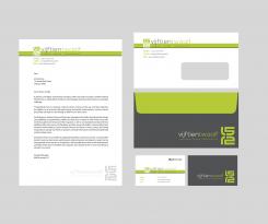
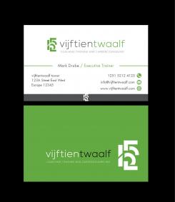
stationary design
Wanted: logo and businesscard for a personal coach & trainer
- Contest holder: Mark Drube
- Category: Logo & stationery
- Status: Ended
Start date: 19-12-2014
Ending date: 07-01-2015
It all started with an idea...
A short, interactive guide helped them discover their design style and clearly captured what they needed.
Brandsupply is a platform where creative professionals and businesses collaborate on unique projects and designs.
Clients looking for a new logo or brand identity describe what they need. Designers can then participate in the project via Brandsupply by submitting one or more designs. In the end, the client chooses the design they like best.
Costs vary depending on the type of project — from €169 for a business or project name to €539 for a complete website. The client decides how much they want to pay for the entire project.
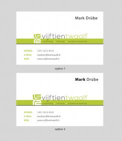
design revised. Please your review. Option 1 & option 2. Something a little changes that bring big impact. Thank you Mark
Hi Mark, I'm happy with our collaboration. It's very valuable to us. and keep in your mind, thant I AM OPEN TO UNLIMITED REVISION. Even if you choose my design as a winner or not. I am very happy to work with you.
Hi Djaya,
thank u for your design. U made all the changes, many thanks. i really like it. now some details. u have mirrored the 15 and the twelve. when i look closely is see that the green line between the green 15 and the white 12 is not exactly in the middle. i makes that the numers are not exactly mirrored. can u make the green line in the middle please.
Hi Djaya,
i really like the design. when i compare your last two designs i see that your previous design has a "heavier"centre. the green line looks a bit firmer than your last. the white 12 has the same height a the green bar. can u do that also with your last design
thank u
logo refining : please your suggestion
this layout i like. use the other logo please. can u use the characters/lettering of your 4th design (see comment)
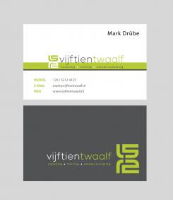
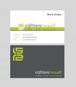
use the backside of your design below please ( with the logo in the down right corner)
is this colour green different? if so, i like this one better.
logo refining : please your suggestion
this logo is nice ( with the horizontal stripe) set up of the card t great. your last contribution has a nive layout.
I like the setup of the backside
No comments
The other one was better. I dont like the black background. it looks a bit like a martial arts logo :)
No comments
this one I like. The logo is a nice variantion on other designs i have seen. the font is nice too. I dont have an office so the part with the adres can be erased. I only need three icons: phonenumber, mailadres and webesite. My last namen is written with an ü (alt 129). my function doesnt have to appear on the businnescard. I like this colour better. I like a fresh green.
on the bottom of the card I see your other logo ( printed in the grey part of the card. i presume that that doesnt belongs there.
can u make some adjustments ?
i like these charakters
 Nederland
 België
 France
 Deutschland
 Österreich
 International
