 Nederland
 België
 France
 Deutschland
 Österreich
 International
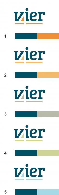
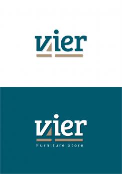
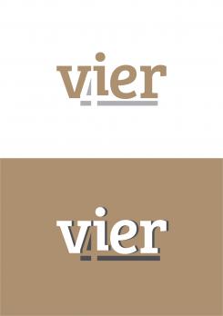
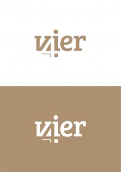
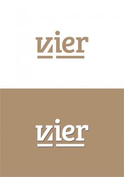
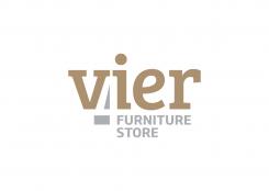
The font used in the logo is Bre Sheriff with small modifications with the letters "V" and "I".
Greeting
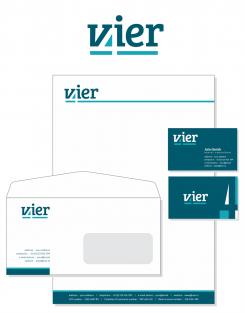
Design a corporate identity for a furniture store and furniture brand
- Contest holder: Jaimy
- Category: Stationery design
- Status: Ended
Start date: 17-10-2016
Ending date: 07-10-2016
Total budget: € 329.00
WINNER
It all started with an idea...
A short, interactive guide helped them discover their design style and clearly captured what they needed.
Brandsupply is a platform where creative professionals and businesses collaborate on unique projects and designs.
Clients looking for a new logo or brand identity describe what they need. Designers can then participate in the project via Brandsupply by submitting one or more designs. In the end, the client chooses the design they like best.
Costs vary depending on the type of project — from €169 for a business or project name to €539 for a complete website. The client decides how much they want to pay for the entire project.
Designer:
 mikidejanovic
Sory, not Bre Sheriff - Bree Serif
Sory, not Bre Sheriff - Bree Serif
Thanks for your nice designs. We would probably have some extra small changes made in the end, but it looks great already.
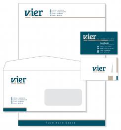
Could you tell me if it's possible the get the letter paper and envelope as a pdf but also as a word document?
Further we would like to receive the the logo and all documents as an esp, psd and png.
Final details and contactdetails for the business card, envelope and letter paper will follow.
Of course. In case you choose my design as you get all the best as you requested, with the changes that you want
This contest is finished. Its not possible to reply anymore.
No comments
Thanks!
We like the blue version the best. But probably than #5fa4b4 (that's a bit less baby-blue ;-))
Also wanted to ask you, are you using aan existing font, or combined/designed font?
I'asking because I need to know if it's a usable webfont for our website.
This contest is finished. Its not possible to reply anymore.
No comments
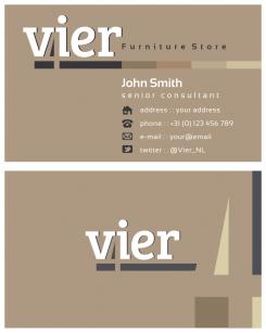
Could you move the contactdetails to the footer on 1 line.
Vier | adress | telephone | email adress | website
And maybe try on a second line
VAT number | Chamber of commerce number | bank account number
In the header no details. Keep the complete/long line for now.
On the envelope only the icons or only words. (same contact details as on business card)
The business card a explained in a former reaction.
This contest is finished. Its not possible to reply anymore.
No comments
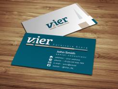
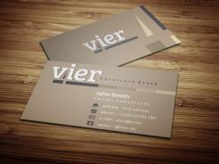
We like the 4 in the corner at the back of the card. Maybe move the logo a bit to the left?
And make the back of the card 'blue' and the front with the contactdetails white.
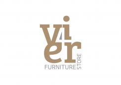
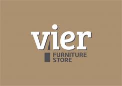
We do not want the 'furniture store' on the card. Just use the regular logo, without the extra line in different color tones.
Also, if you use the contact-icon, we don't need the icon explained in words after it. So only icons, or only words.
Keep it very clean and simple ;-)
Items on business card can be:
Name
titel
Address
Telephone
Email adress
Website
This contest is finished. Its not possible to reply anymore.
No comments
Hi, we like this one with the 'blue' color. But are not crazy about the brown/beige. Could you make some versions with a differtent second color, so we can see the difference? So the 'blue' stays, but some different colors for the brown/beige.
Also, we don't like the shade anyway. sorry. We wanted to see if it could mak a nice detail. But we like it more without a shade.
This contest is finished. Its not possible to reply anymore.
No comments
This contest is finished. Its not possible to reply anymore.
No comments
This contest is finished. Its not possible to reply anymore.
No comments
This contest is finished. Its not possible to reply anymore.
No comments
This contest is finished. Its not possible to reply anymore.
No comments
Is it possible to also put in a shadow in the white background version?
Maybe a version in color #315a6c (or simular)
This contest is finished. Its not possible to reply anymore.
No comments
This contest is finished. Its not possible to reply anymore.
No comments
This contest is finished. Its not possible to reply anymore.
No comments
This one whith the small font is also nice. Looks a bit more friendly.
This contest is finished. Its not possible to reply anymore.
No comments
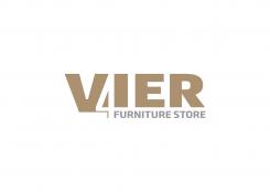
Hello! Thanks for your designs. I like this one the best. But we do not want a subtitel in the logo. Also the letters are bolder than the 4. Can't promiss this is the wat to go, but there might be something there. Jaimy
This contest is finished. Its not possible to reply anymore.