 Nederland
 België
 France
 Deutschland
 Österreich
 International
No comments
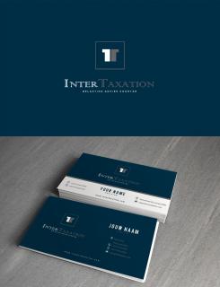
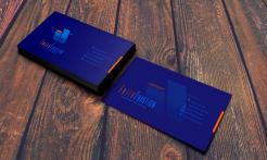
New corporate identity for a tax advisory firm
- Contest holder: Belastingadvieskantoor
- Category: Stationery design
- Status: Ended
Start date: 16-07-2015
Ending date: 27-07-2015
Total budget: € 229.00
WINNER
It all started with an idea...
A short, interactive guide helped them discover their design style and clearly captured what they needed.
Brandsupply is a platform where creative professionals and businesses collaborate on unique projects and designs.
Clients looking for a new logo or brand identity describe what they need. Designers can then participate in the project via Brandsupply by submitting one or more designs. In the end, the client chooses the design they like best.
Costs vary depending on the type of project — from €169 for a business or project name to €539 for a complete website. The client decides how much they want to pay for the entire project.
Designer:
 LPL
LPL
This contest is finished. Its not possible to reply anymore.
No comments
This contest is finished. Its not possible to reply anymore.
No comments
This contest is finished. Its not possible to reply anymore.
No comments
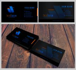
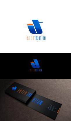
Hi, Sir,i thought about what you said that most of the business cards there are mostly in white background. I thought ,sometimes,in order to be remembered we have to deviate from the norms. Black somehow will represent formality.This is only my opinion , sir.
Would you want this to be in white background, sir?:)
This contest is finished. Its not possible to reply anymore.
No comments
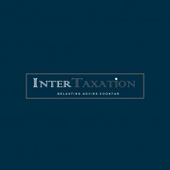
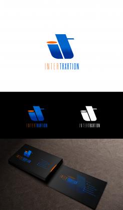
I thought you might want to see the logo on a different color background. I also amend the font for InterTaxation. Should there be anything that you want sir, please let me know.
Blue on blue doesnt work for us. Most business cards have a white background in our (business) culture.
ok, sir, i will do a white version also.
This contest is finished. Its not possible to reply anymore.
No comments
Good day, Sir, the words in Dutch and in English are interchangeable with the design.
This contest is finished. Its not possible to reply anymore.
No comments
Hi, Sir, do you have any specific color that you like? this logo is flexible in color.
We do like mutiple shades of blue. The design of the card is very nice but how can we adjust it in way that we can present a business card which is in English on one site and in Dutch on the other?
What specific words would you like to be written at the back of the card, sir?
i mean the words in Dutch
Both sides we be the same but one will be written in English , the other (with the same information) in Dutch. This way we can have 1 business card and it doesnt matter if we hand it out to Dutch clients or international clients.
Although we like the logo design we are of the opinion that the letters "it" are so linked to "information technology" that we prefer another kind of logo. But we hav to say that it is done in a very nice way (one of the best so far)
Ok, sir, thank you for the feedback, it will help me create the way you like it.
This contest is finished. Its not possible to reply anymore.